Creating custom components (Alpha)
This feature is currently in its Alpha stage of development.
- As an early version, it may not include all planned functionalities and is subject to significant changes based on ongoing development and user feedback.
- In this phase, the feature may contain bugs or behave unpredictably.
- recommends using standard, fully supported components until this feature has been fully tested and refined.
- We encourage you to provide feedback and report any issues to help us improve and refine the feature for future releases.
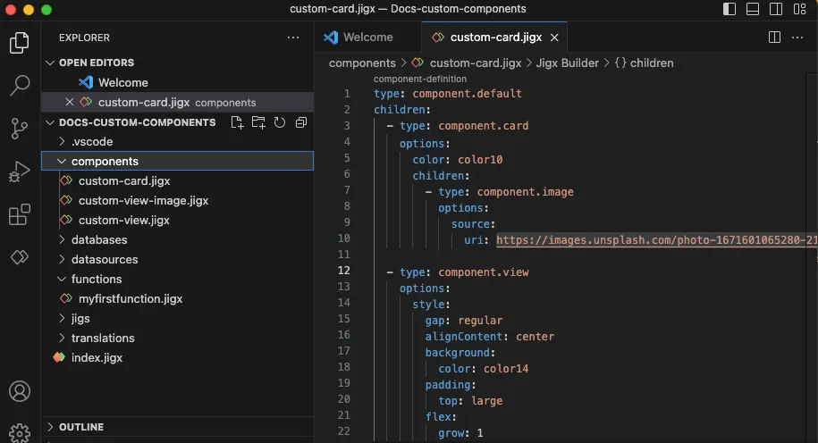
In a project all custom components are created in the components folder with the .jigx extension, for example, custom-card.jigx. You can create subfolders inside the component folder if required. Ensure you use a unique naming convention for each file in each folder. If files have the same name uses the first file found in the components folder with that name and shows it in the IntelliSense code snippet in a file. If you have a components folder under s or elsewhere in your project, sees it as components and validates the s against the rules of components.

All custom component files start with:
type: component.default children:
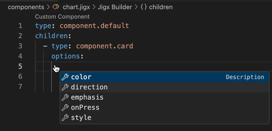
Under children: you add the components you want to customize. Invoke IntelliSense to see the list of available components.
Between options: and children: you can add predefined styling elements depending on the component selected. The components that allow customization are Card (Alpha), View (Alpha), Text (Alpha), Icon (Alpha), and Button (Alpha). Use IntelliSense to view the available list.

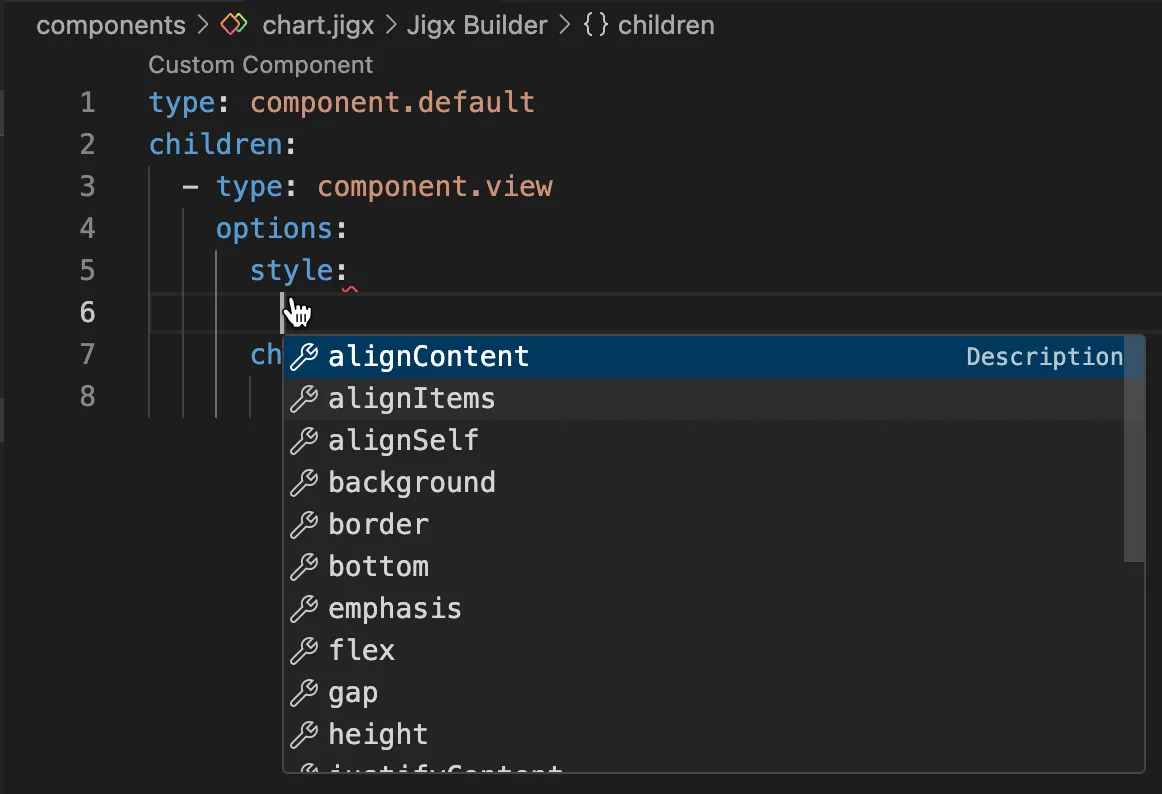
For component.view the options: followed by style: are required before children:. All available styling elements are listed under the style: property using IntelliSense.

You can use the custom component files in multiple files by referencing component.custom-component and using the componentId: property to reference the name of the custom component file. Adding an instanceId allows the same custom component to be used in different instances and enables the use of outputs.
In the Reference & Examples tab, you can see code examples for each custom component.
