Card (Alpha)
This feature is currently in its Alpha stage of development.
- As an early version, it may not include all planned functionalities and is subject to significant changes based on ongoing development and user feedback.
- In this phase, the feature may contain bugs or behave unpredictably.
- recommends using standard, fully supported components until this feature has been fully tested and refined.
- We encourage you to provide feedback and report any issues to help us improve and refine the feature for future releases.
The card component adds context or highlights information in the . The card itself is a container with integrated padding, background, and row rules, meaning every component placed in the card will be represented as a separate row with spaces between the rows.
For steps on creating a custom component, see How to create a custom component.
You can use when and instanceId with component.card, add the properties before the options property. The available list of options is shown below.
Options | Value |
|---|---|
color | Multiple, use IntelliSense to view the available list. |
direction | row - creates a vertical layout in a row. column - creates a horizontal layout in a column. |
emphasis | extra-low, low, low-medium, medium, high |
onPress | Multiple, use IntelliSense to view the available list of actions. The action is called when the card is pressed. |
style | isDisabled - true or false |
- The card component has predefined behavior for its children, ensuring the children's components, such as images, are flexible by default.
- The View (Alpha) component combined with the card enables the precision of the layout design. For example, the view can be used to create rows to contain cards and provide spacing between the cards.
- When using component.image on custom components, the isFlexible property is available. If the property is set to true the image will take the parent's space. If the parent has zero height or zero width, the image will not render. It would be best if you decided either to set the height and width on the image or set isFlexible to true.
- The recommended approach when using component.image is to use component view as a wrapper component with a defined height, e.g., 100, and setting isFlexible: true for each image. This allows the images to grow into the parent component space.
- By default, children components are stacked in a column.
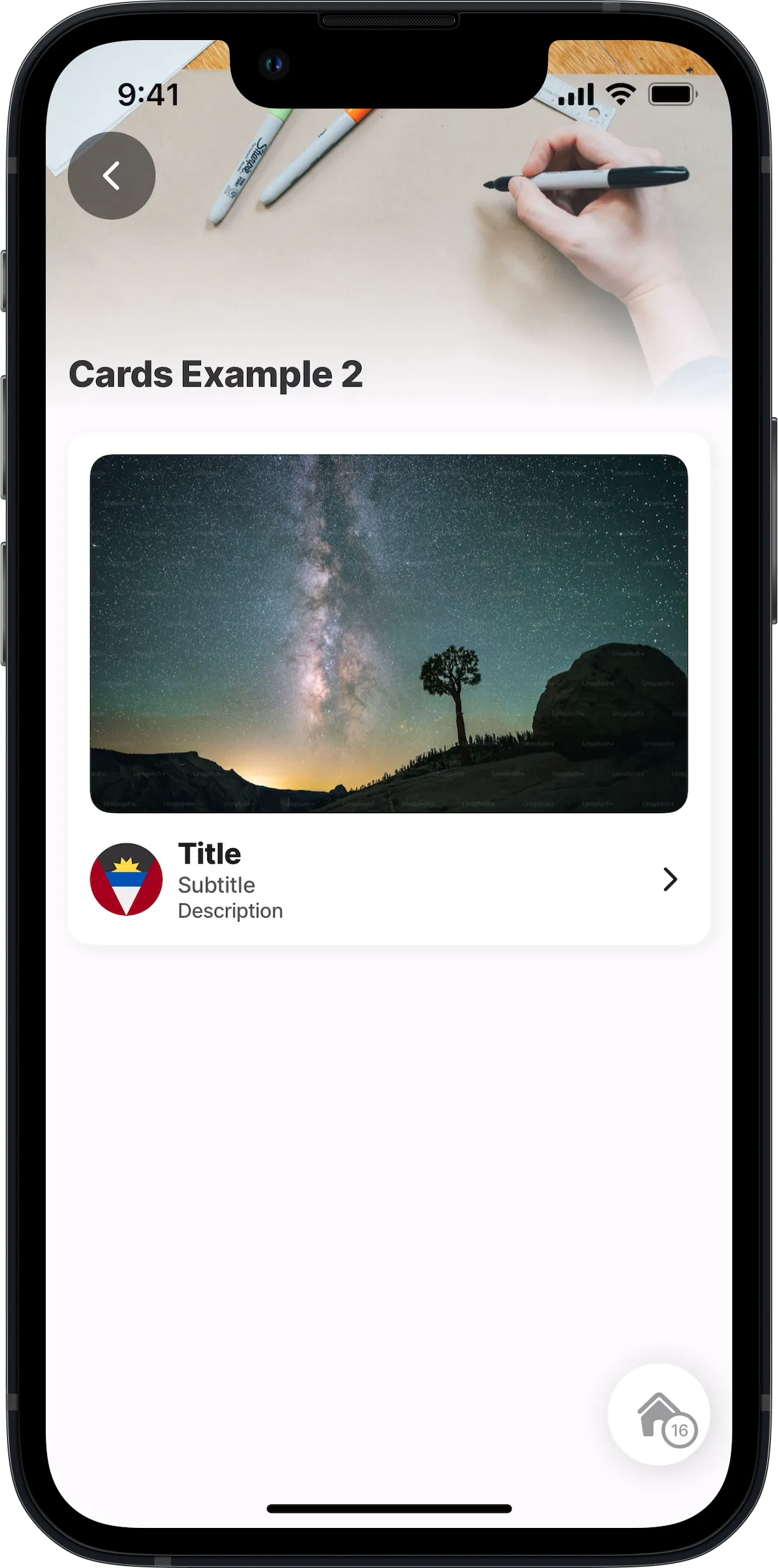
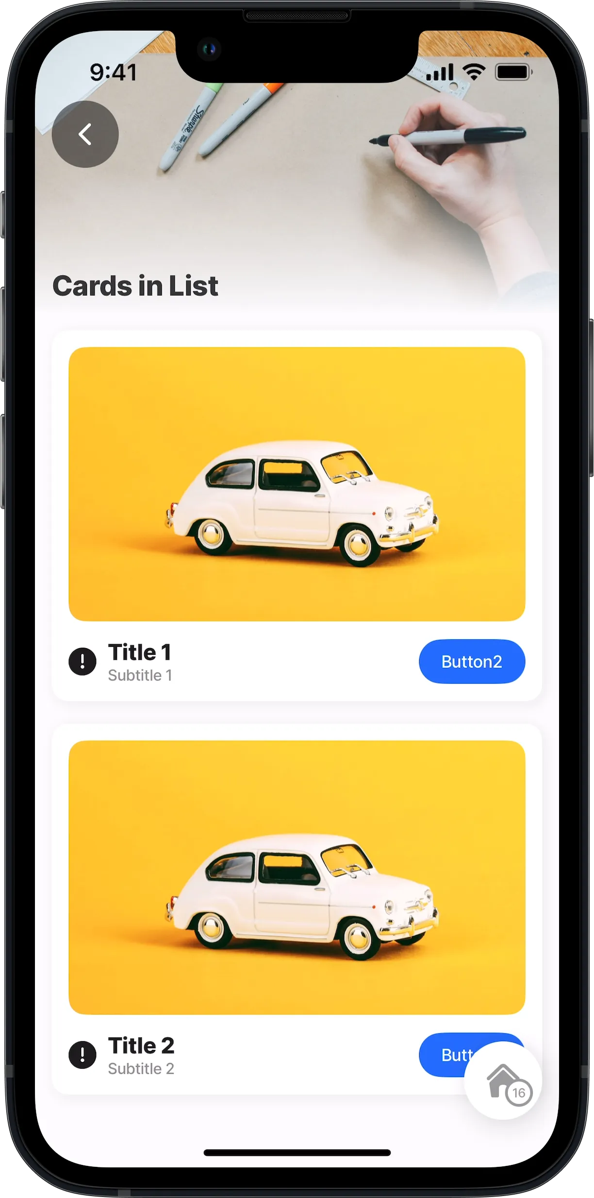
This example shows how to use the component.card in a component.list. In the card is an image and view component. the view is used to create the layout positions for the icon, text, and button components below the image.
Examples:
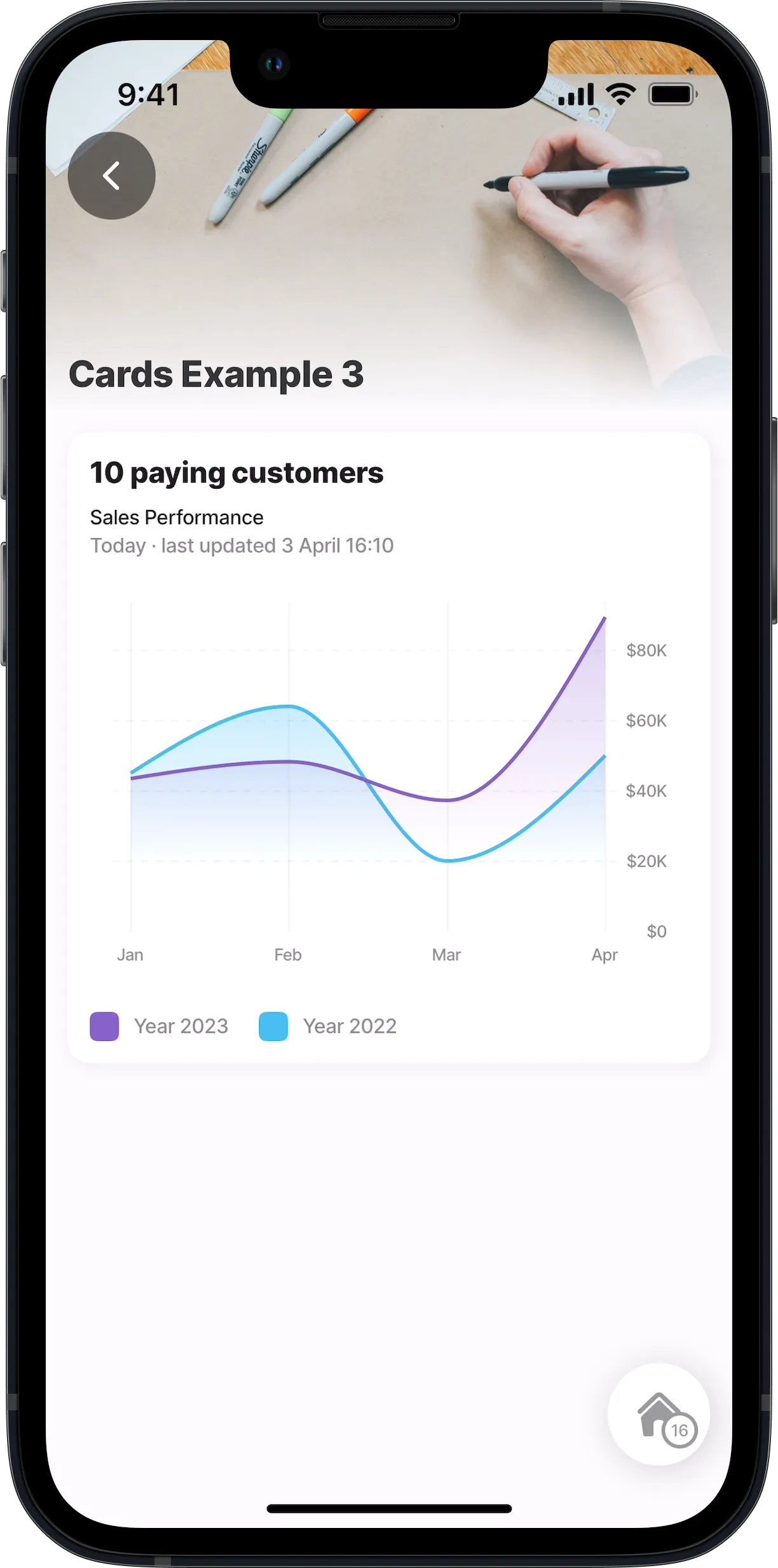
This example demonstrates how to show a line-chart component in a component.card. Take note of how the layout configuration is created by using the component.view multiple times and even inside another component.view. In the configuration inputs are required for the chart in the custom component to reference the datasource.
Examples:
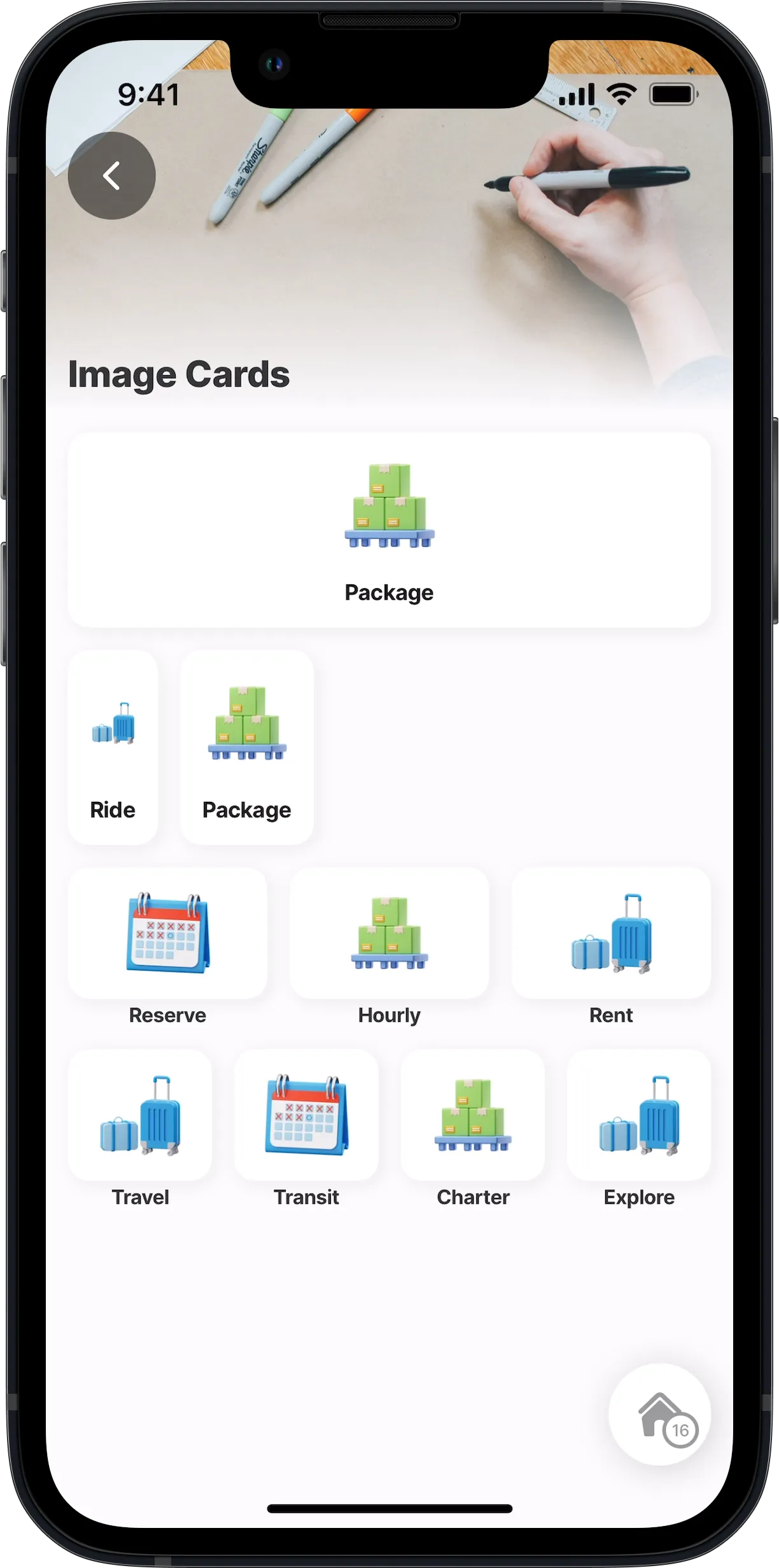
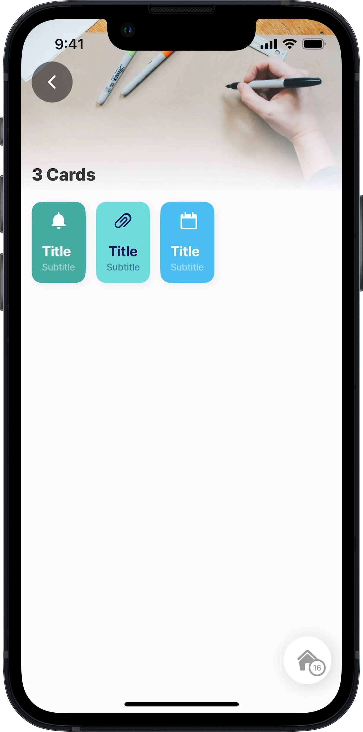
This example demonstrates how to use the view component to create the row layout for multiple card components to create three cards displayed horizontally. Take note of how the layout configuration is created by using the view component multiple times and even inside the card to create the correct layout for the icon and text components.
Examples:
Explore a variety of additional code examples demonstrating the use of the card component on GitHub. These examples showcase different configurations and use cases to help you get the most out of the card component.
