View (Alpha)
The component.view is an empty container similar to the <div> element in CSS or HTML. Use the view component for layouts. The YAML always has the style: property under which all style elements such as color and direction for rows and columns are located, and the children: property for adding other components such as avatar, text, and icons. Multiple layers of the view component can be used to create UI requirements. You can also place a component.card inside the view and vice versa. If you are unfamiliar with CSS or HTML, there are several resources available, such as https://www.w3schools.com/, that can assist you when configuring a view component.
For steps on creating a custom component, see How to create a custom component.
You can use when and instanceId with component.view, add the properties before the options: property. The available list of style options is shown below.
Options | Value |
|---|---|
alignContent | Determine how content in the view will be aligned, applies to any component contained in the view. The following options are available: center flex-end flex-start space-around space-between stretch |
alignItems | Available options include: baseline center flex-end flex-start stretch |
alignSelf | Available options include: auto baseline center flex-end flex-start stretch |
background | color - multiple, use to view the available list. See Jigx color palette to view the different colors. emphasis - change the brightness and boldness of the content in the view. Available options include: - high - medium - low - extra-low - low-medium |
border | Configure the border using these properties: bottom color - multiple, use to view the available list. emphasis end left right start - style style - solid, transparent, true top |
bottom | Configure the spacing at the bottom of the view using these properties: large medium small regular minimal none |
emphasis | Change the brightness and boldness of the content in the view. Available options include: high medium low extra-low low-medium |
flex | Available options include: basis- use a number or expression. direction - column, column-reverse, row, row-reverse grow - use a number or expression shrink - use a number or expression wrap - wrap, nowrap, wrap-reverse For more information on using the flex property, see CSS-Tricks - A complete guide to Flexbox |
gap | Configure the gap in the view. Available options include: column - large, medium, small, regular, minimal, none large medium none minimal regular row - large, medium, small, regular, minimal, none small |
height | Determine the height of the view. Available options include: max min value |
justifyContent | Available options include: center flex-end flex-start space-around space-between space-evenly |
left | Available options include: large medium small regular minimal none |
margin | Configure different margins in the view, available options include: bottom - large, medium, small, regular, minimal, none end - large, medium, small, regular, minimal, none horizontal - large, medium, small, regular, minimal, none large left - large, medium, small, regular, minimal, none medium minimal none regular right - large, medium, small, regular, minimal, none small start - large, medium, small, regular, minimal, none top - large, medium, small, regular, minimal, none vertical - large, medium, small, regular, minimal, none |
overflow | Available options include: hidden scroll visible |
padding | Configure different paddings in the view, available options include: bottom - large, medium, small, regular, minimal, none end - large, medium, small, regular, minimal, none horizontal - large, medium, small, regular, minimal, none large left - large, medium, small, regular, minimal, none medium minimal none regular right - large, medium, small, regular, minimal, none small start - large, medium, small, regular, minimal, none top - large, medium, small, regular, minimal, none vertical - large, medium, small, regular, minimal, none |
position | Available options include: absolute relative |
radius | Available options include: large medium regular small tiny bottomLeft - large, medium, regular, small, tiny bottomrRight - large, medium, regular, small, tiny topRight - large, medium, regular, small, tiny topLeft - large, medium, regular, small, tiny |
right | Available options include: large medium small regular minimal none |
top | Available options include: large medium small regular minimal none |
width | Available options include: max min value |
- When using the component.image on custom components, the isFlexible property is available. If the property is set to true, the image will take the parent's space. If the parent has zero height or zero width, the image will not render. Set the height and width on the image, or set isFlexible to true.
- When using the component.image in the component.view to define the height, e.g., 100, and setting isFlexible: true for each image. This allows the images to grow into the parent component space.
- In styles, you cannot use flexGrow and width together. Use one or the other; if combined, the width property does not function, and the UI element will not render as designed.
- By default, children components are stacked in a column.
- To ensure that text and icons do not run over borders in the app, use flex:grow:1 and shrink:1 together.
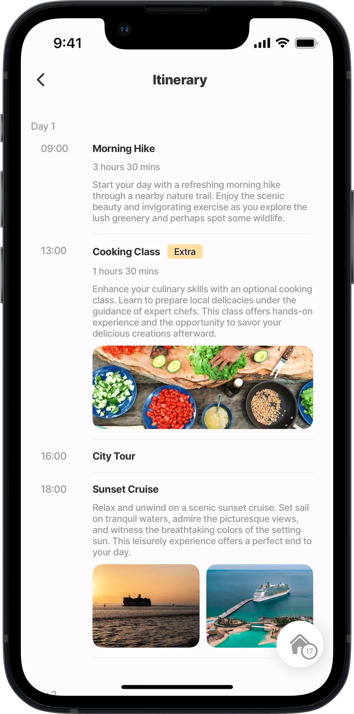
This example shows using the component.view to create the layout for an itinerary. The view component creates a wrapper for the content, rows to show content in, and columns to create spacing between the content. The component.text is used inside the view component to show the content and the component.image shows the required images.
Examples:

