jig.tabs
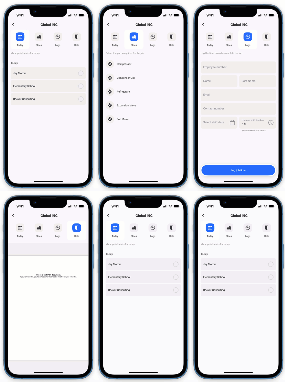
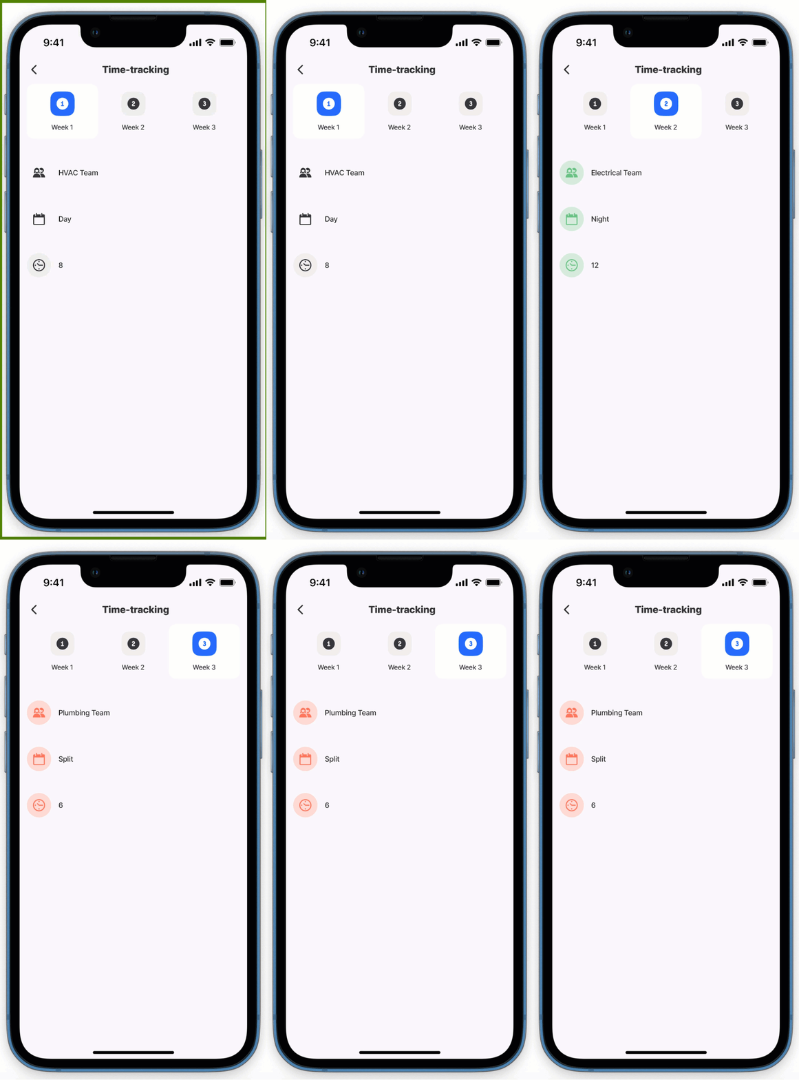
Tabs allow you to navigate between different s with ease, enhancing the user experience by providing an organized layout. These tabs are placed at the top of the screen to ensure a sleek and intuitive interface.

The jig.tabs can be configured in the following way in .
Core structure | |
|---|---|
title | Give the a title that is displayed at the top of the screen. |
type | Select jig.tabs. |
jigId | Provide the jigId for the that will be displayed when the tab is active. |
instanceId | Give the tab a unique identifier, that can be used in expressions. |
tab |
|
Other options | |
|---|---|
areTabsScrollable | When there are many tabs that exceed the width of the screen, set the property to true to scroll and view the additional obscured tabs by swiping left. Setting the property to false will only display the tabs that fit on the width of the screen, additional tabs will be hidden. The property is accessible using IntelliSense at the root level in the YAML. By default tabs are scrollable. Tip: Using areTabsScrollable: false will align the tabs in the center. |
inputs | Used to pass data between the s in the tabs to provide context and data. See Passing data using inputs for more information. |
instanceId | Give the tab a unique identifier allowing you to reference the tab in expressions in s. |
initialTabId | Specify the tab to display when the opens. The tab's jigId is used as the value. This property is accessible via IntelliSense at the root level in the YAML. If not specified, the first tab is displayed by default. |
isDisabled | If true you won't be able to toggle the tabs. The default value is false. |
isSwipeable | Set to true allows you to navigate between tabs by swiping left and right anywhere on the . By default tabs are not swipeable and require you to press on the tab title for navigation. |
when | This property is used to show/hide any tab based on conditions, such as true, false, or conditions set using an expression. |
Actions | |
|---|---|
actions | The actions property is a local action applicable to the specific tab. Once the tab is tapped the action will execute.
See the Tabs with actions code example below. |
State Configuration | Key | Notes |
|---|---|---|
=@ctx.jig.state. | activeTabId | Applies to the active tab in the jig.tab type. |
=@ctx.solution.state. | tab | Global variable for the tab used throughout a solution. |
- Specifying a background color for tabs is currently not supported.
- jig.headers do not display in the children tabs.
- Using areTabsScrollable: false aligns the tabs in the center, aligns the tabs at the center, enhancing visual consistency.


