Combine custom & standard components (Alpha)
This feature is currently in its Alpha stage of development.
- As an early version, it may not include all planned functionalities and is subject to significant changes based on ongoing development and user feedback.
- In this phase, the feature may contain bugs or behave unpredictably.
- recommends using standard, fully supported components until this feature has been fully tested and refined.
- We encourage you to provide feedback and report any issues to help us improve and refine the feature for future releases.
Combining Custom components (Alpha) with Standard components enables the creation of advanced functionality and rich user interfaces. Standard components, such as stepper , progress-bar , and countdown , provide a reliable foundation for common interactions, ensuring consistency and usability. By integrating custom components and tailored elements designed to meet specific requirements, you can extend this functionality to create dynamic features like interactive menus, tabbed navigation, and toggles with unique behaviors. This blend allows for a balance between efficiency and creativity, enabling apps to stand out with innovative designs while maintaining intuitive user experiences.
Additionally, you can take this further by creating entirely new components through the clever use of custom components or by combining standard and custom components. These new components can encapsulate specialized functionality, offer unique visual elements, or address specific user needs, opening up endless possibilities for tailored solutions. To ensure the reuse of custom components in the same or in different s, you can use Inputs & outputs (Alpha).
This approach encourages modular development, fostering scalability and adaptability, whether for small projects or enterprise-grade applications.
Here are code examples to illustrate combining custom and standard components to build advanced features.
- When using component.image in a custom component, the height property must be specified as part of the size property. Otherwise, validation errors occur, see below:
The examples use a set of custom components called sections. The sections are for titles, spacing, and context. The sections code is available on GitHub.
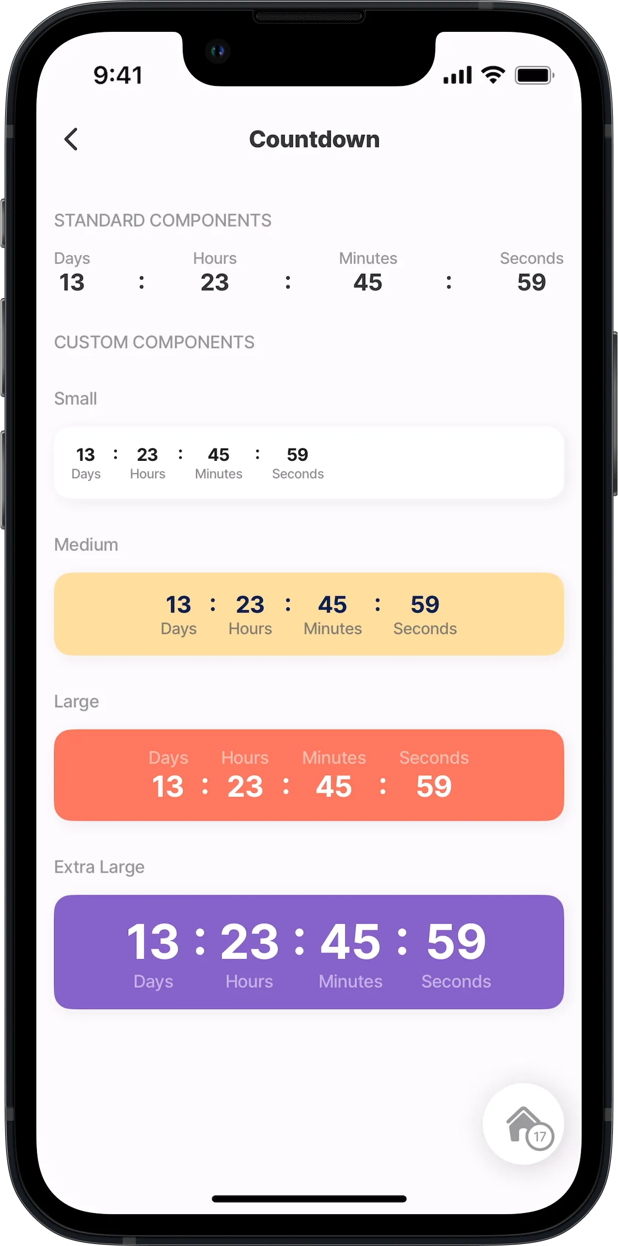
In this example, the first component.countdown is a standard component and the following four are custom components. Here, the component.countdown is configured in a component.card with color.
Example:
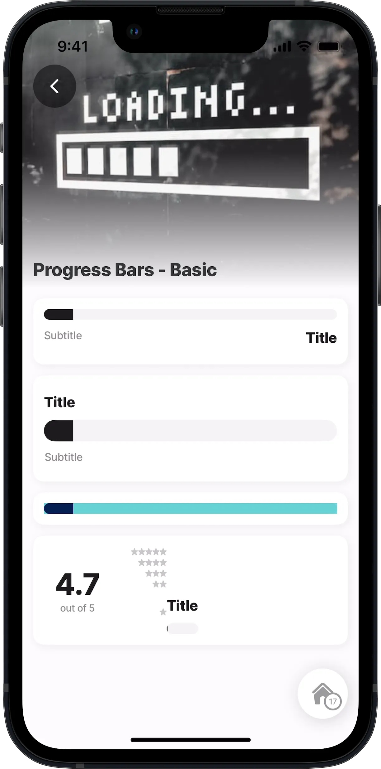
More examples of customized progress bars are available on GitHub:
| |
|---|---|
Progress-bar sizes (Dynamic) | |
Progress-bar steps (Dynamic) | |
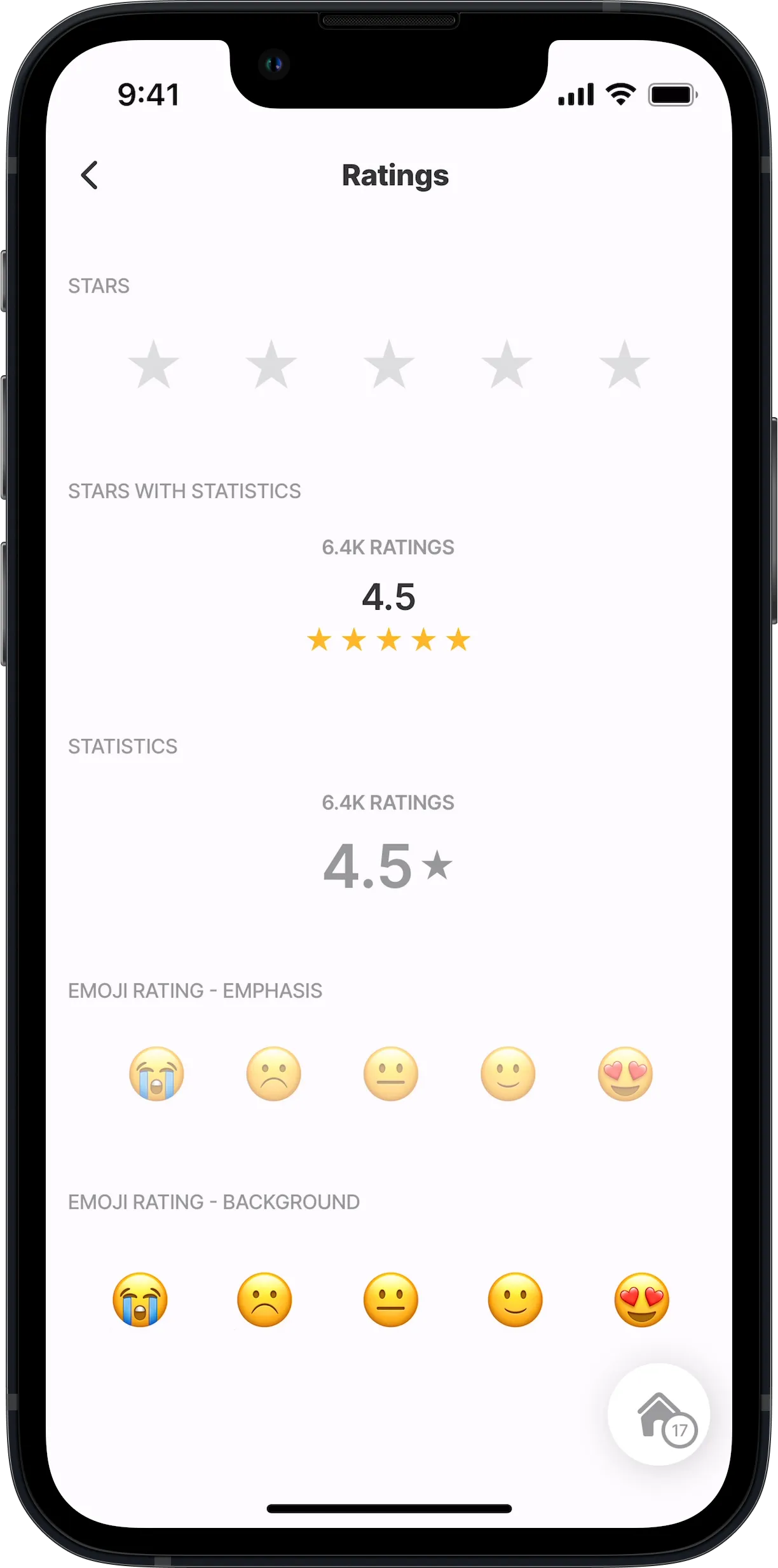
This example demonstrates how you can create your own component using the custom components. Here various rating components are created by configuring the component.view and component.text.
Example:
This example demonstrates how you can create one custom component and reuse it multiple times, in this instance, in the same . We use inputs to show different data and elements in each reuse of the custom component. Here a standard component.avatar is combined with component.view, component.text and component.icon.
Example:
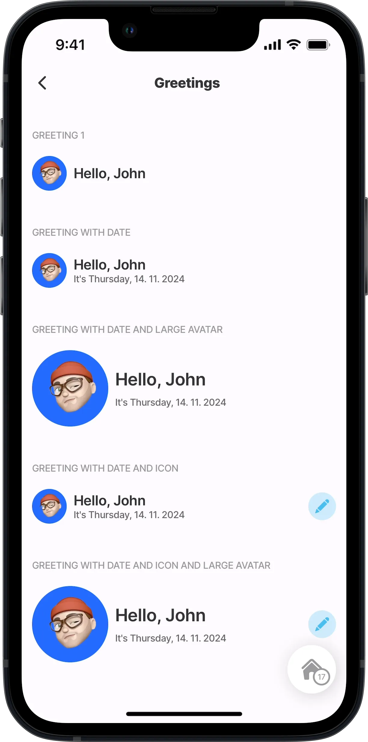
More examples of customized sections are available on GitHub:
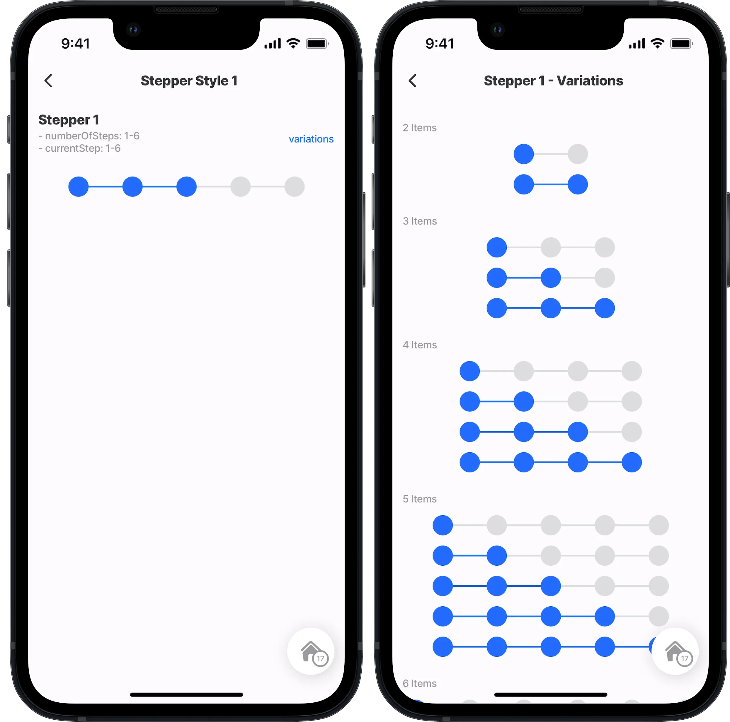
This example demonstrates how you can create one custom component and reuse it multiple times, in this instance in the two different s. We use inputs to show the number of steps and current steps in each reuse of the custom component. Here a stepper component is created by configuring the component.view.
Example:
More examples of customized sections are available on GitHub:
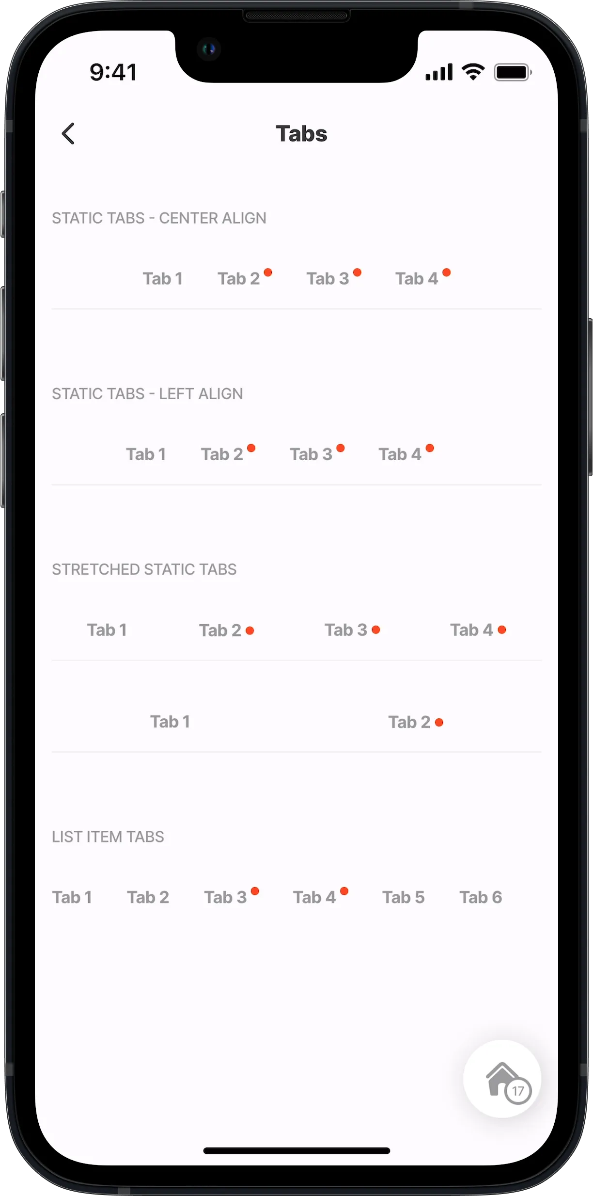
This example demonstrates how you can create custom components and reuse them multiple times. We use inputs to show the tab value, name, indicator and alignment in each reuse of the custom component. Here tab components are created by configuring the component.view. Additionally, we show how to reference a custom component inside a standard component.list-item.
Example:
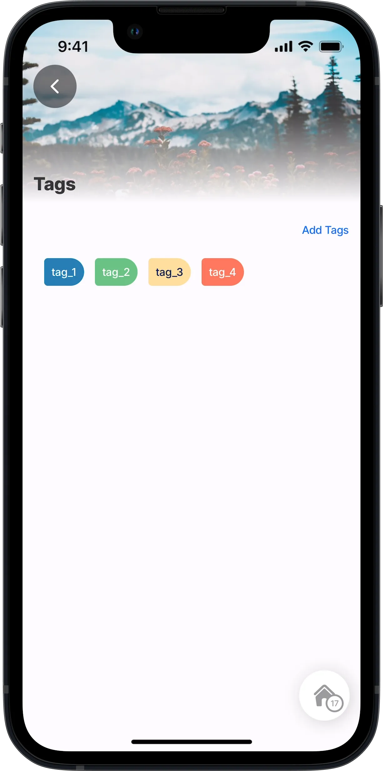
This example demonstrates how you can create tags in a custom component. We use inputs in the custom component to show the tag color and title. Here a tab component is created by configuring the component.view and component.text. Additionally, we show you how to reference a custom component inside a standard component.list, and use a second custom component to create an action allowing you to tap a link at the top to add new tag.
Example:
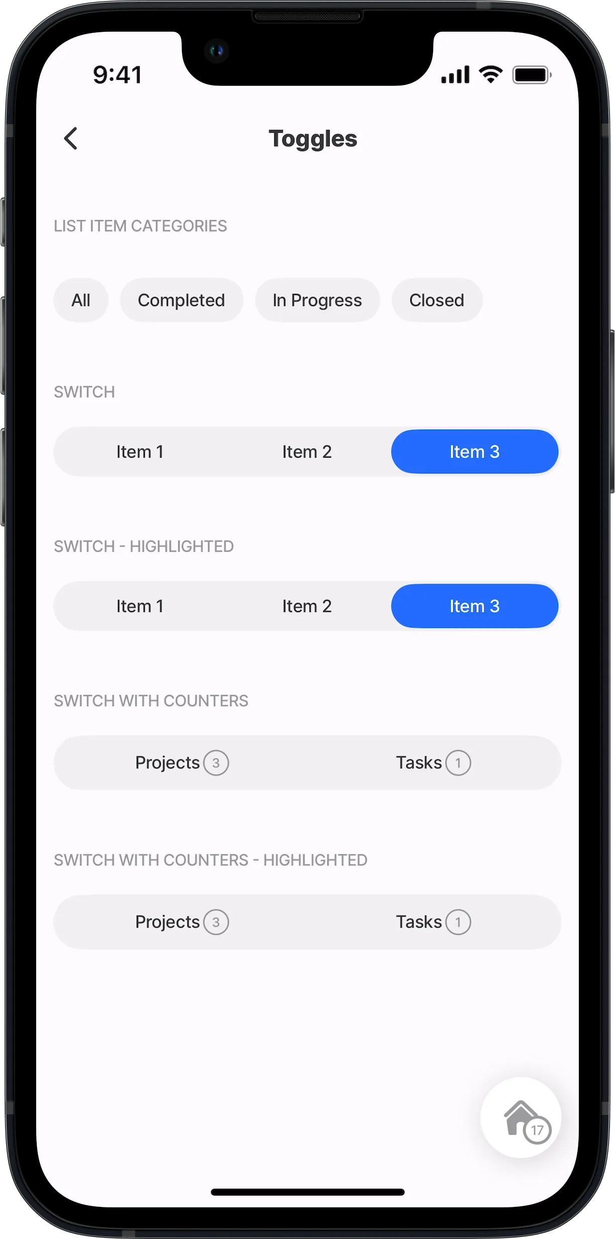
This example demonstrates how you can create a custom component providing the functionality to toggle. We use inputs to determine the toggle name, highlighting and value. Here a toggle component is created by configuring the component.view and component.text. Additionally, we show you how to reference a custom component inside a standard component.list. The custom component is configured with the onPress event to trigger an action when the toggle is pressed.
Example:
