charts
The component can display statistics related to data records (categorical variables). This can be used to show a single series or multiple series of data for comparative purposes and highlight specific regions or ranges on the chart to make it easier for users to interpret and analyze the data.This component is mostly used in jig.default or jig.list.
Chart data is structured in a way that makes it easy to display. To understand how to create the YAML for a chart in let's look at the data in various formats and how you can use the data in .
- Let's start with the financial data per quarter for three years from a Microsoft Excel table, as shown below:

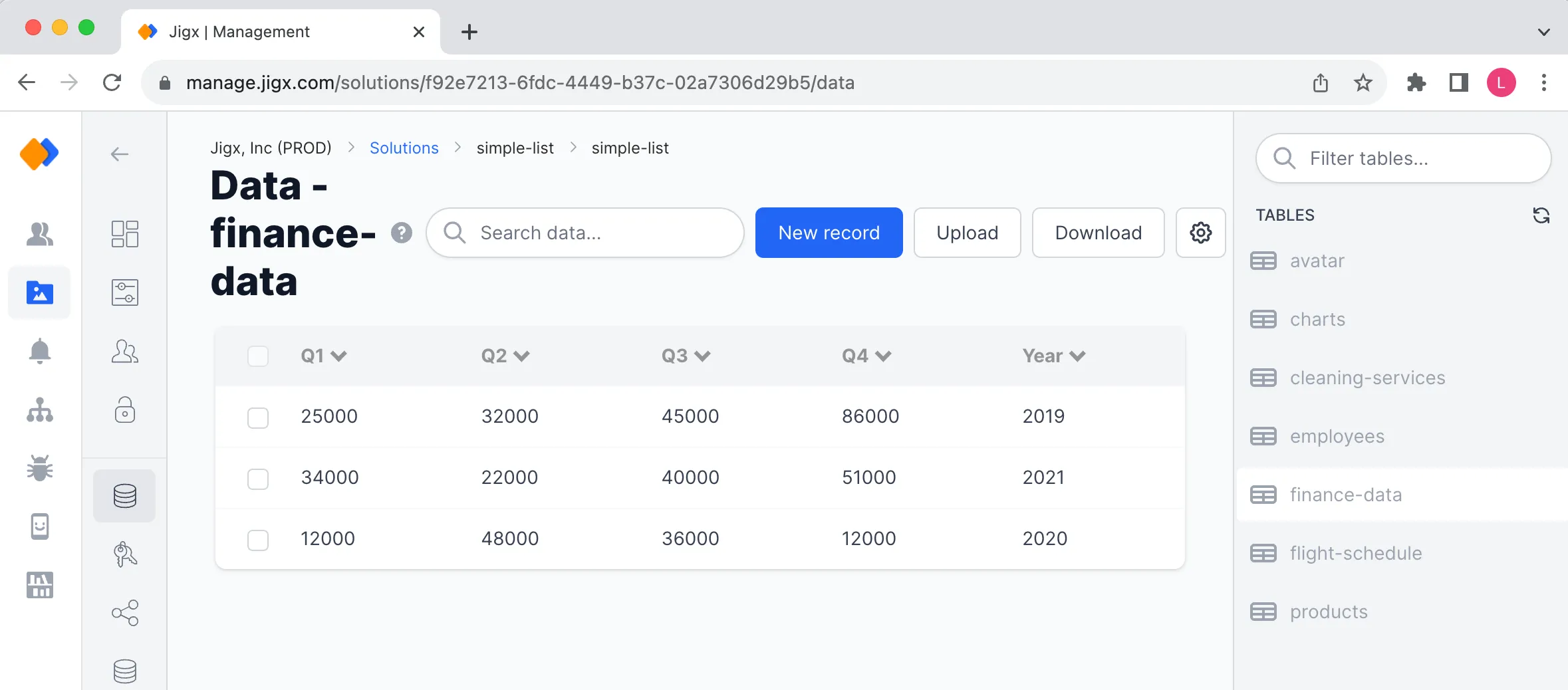
- Next we map out the same data in Dynamic Data in . Notice that the data is exactly the same as the Excel data.

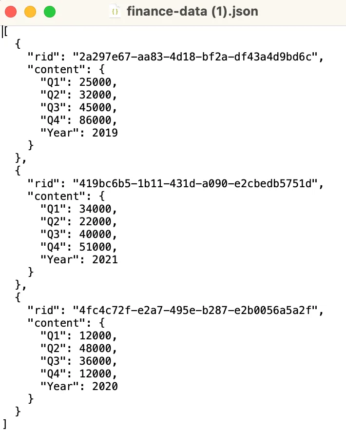
- The same data can also exist in a JSON file. Using the Download button at the top-right of the Data-finance-data table shown above will download the data into a JSON file. The JSON is shown below.

Now that you have your data you can convert it into the YAML needed for the charts. The data can be used as a static datasource or a dynamic datasource.
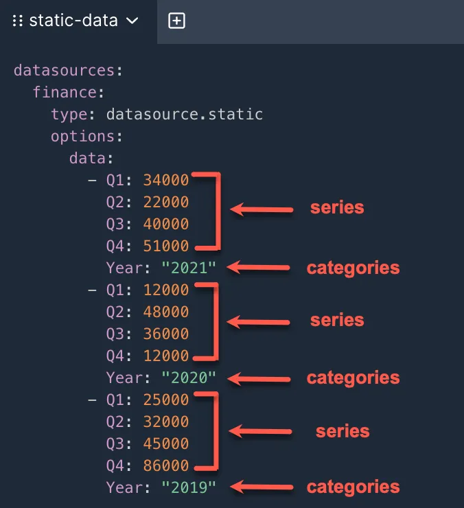
Using the finance-data.json it was easy to convert the data into YAML as shown below.
In you can use the data from the dynamic data table, in this instance data-Finance-data, then create a file under datasource folder. Use the Dynamic data provider that references the finance-data table with a query selecting the data you want to use, quarters and year in this example.
In the YAML for charts the following keys are used: - yAxis - xAxis - categories - series
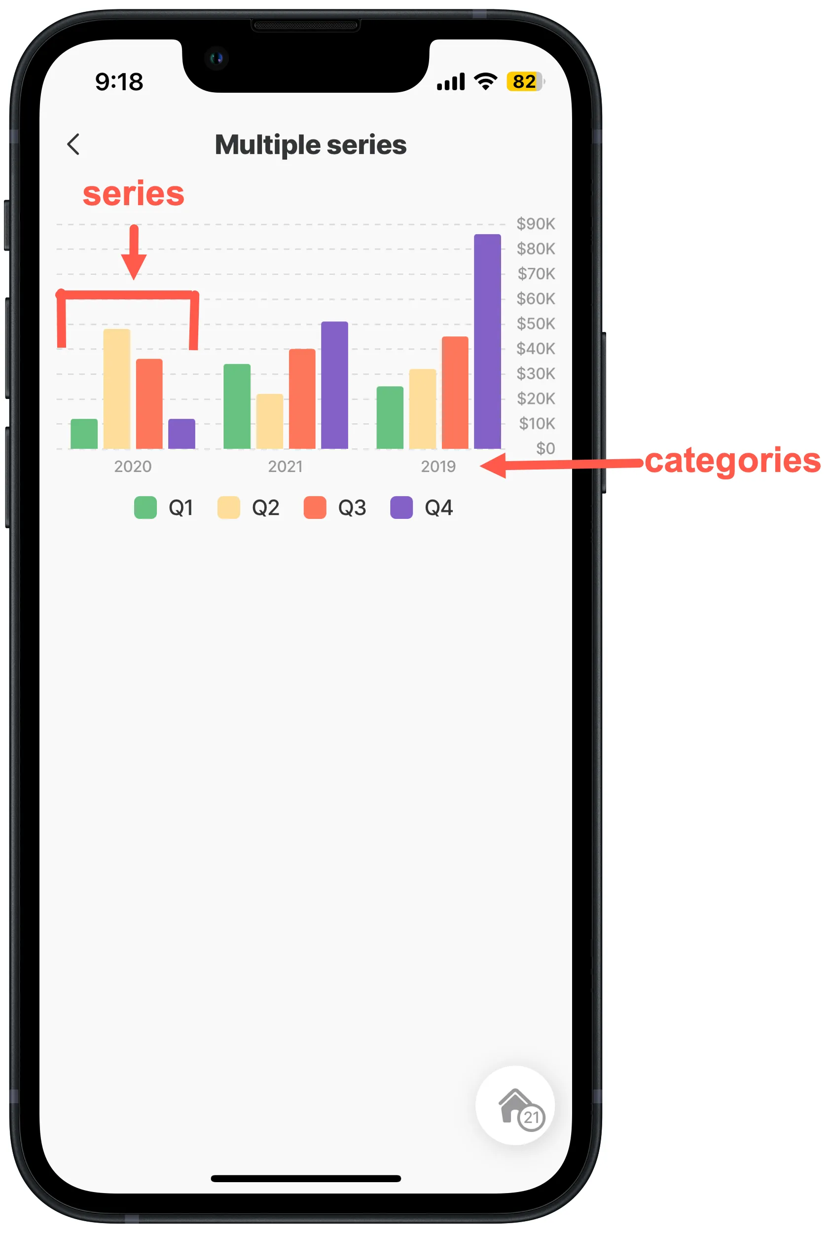
In this example the finance-data would show as follows for each key.

Now it is possible to create charts in YAML with the exact same data, for example a bar and line chart with the finance-data in the above YAML keys is shown below. Notice in the YAML below that the same YAML is used for both the bar and line chart.
The component.bar-chart in the using the finance- data.

The component.line-chart in the using the finance- data.


