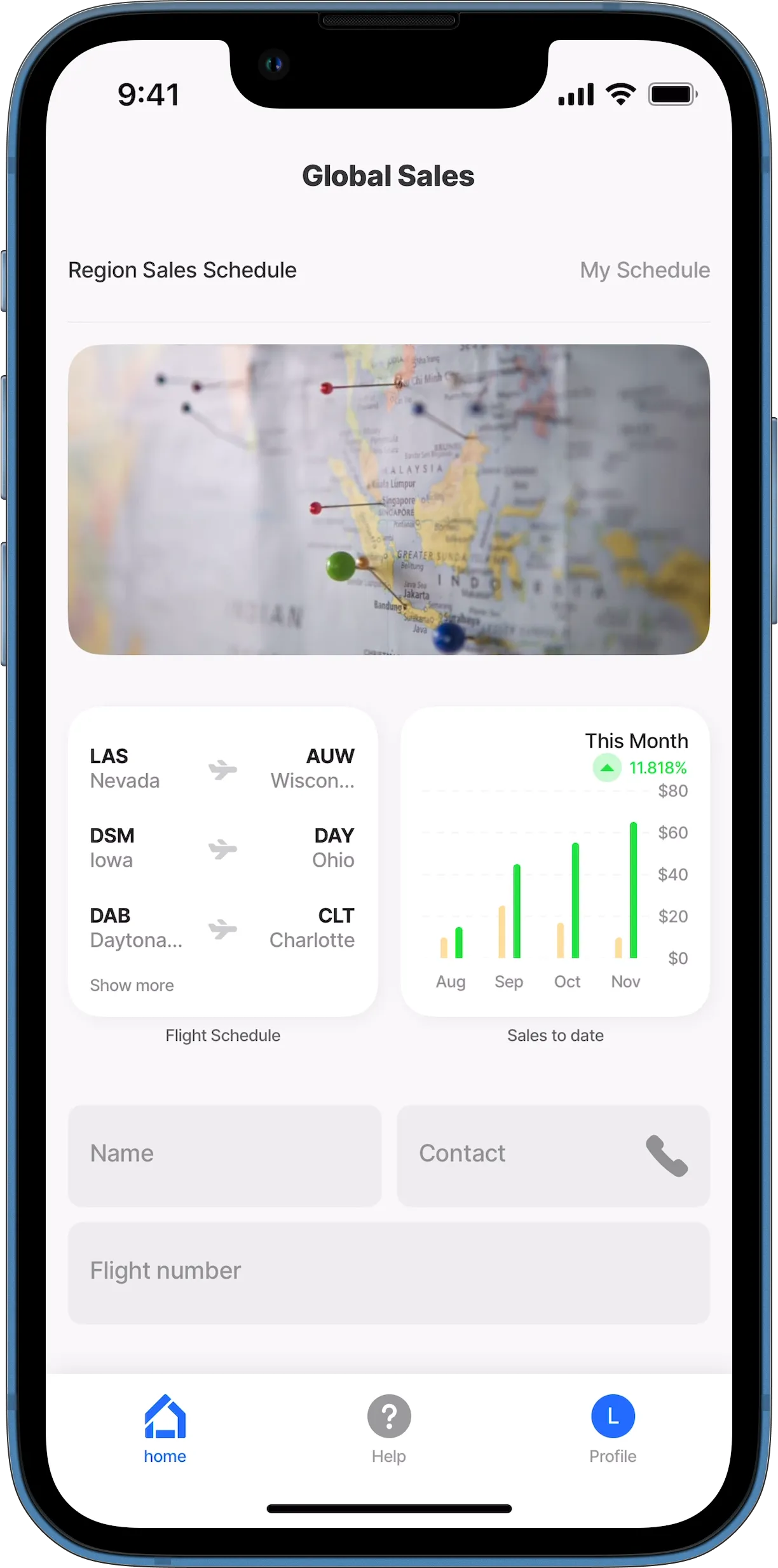
grid
The grid component enables you to create grid layouts in your app, organizing content into rows and columns for a visually consistent and flexible interface. It helps align elements proportionally, ensuring a structured design. The grid is ideal for creating galleries to display photos or product images, dashboards, menus, and product lists. This component is very similar to the jig.grid the only exception is that this component can be used in a jig.default with other components.
The grid component has two available configuration options:
- Auto Grid - used to create a grid layout from a datasource. This is similar in configuration to a jig.list where a single grid-item is configured and iterates through the datasource.
- Custom Grid - used to create a custom grid layout using widgets, images, or custom components in various sizes.
Core structure | |
|---|---|
type | Within a grid component, the grid-item component is used to define each of the elements in the grid layout. Within the grid-item a select set of components can be configured. |
data | Configure a datasource to call the data in the grid layout. The data property is required for the Auto Grid, but is optional for the Custom Grid selection. |


