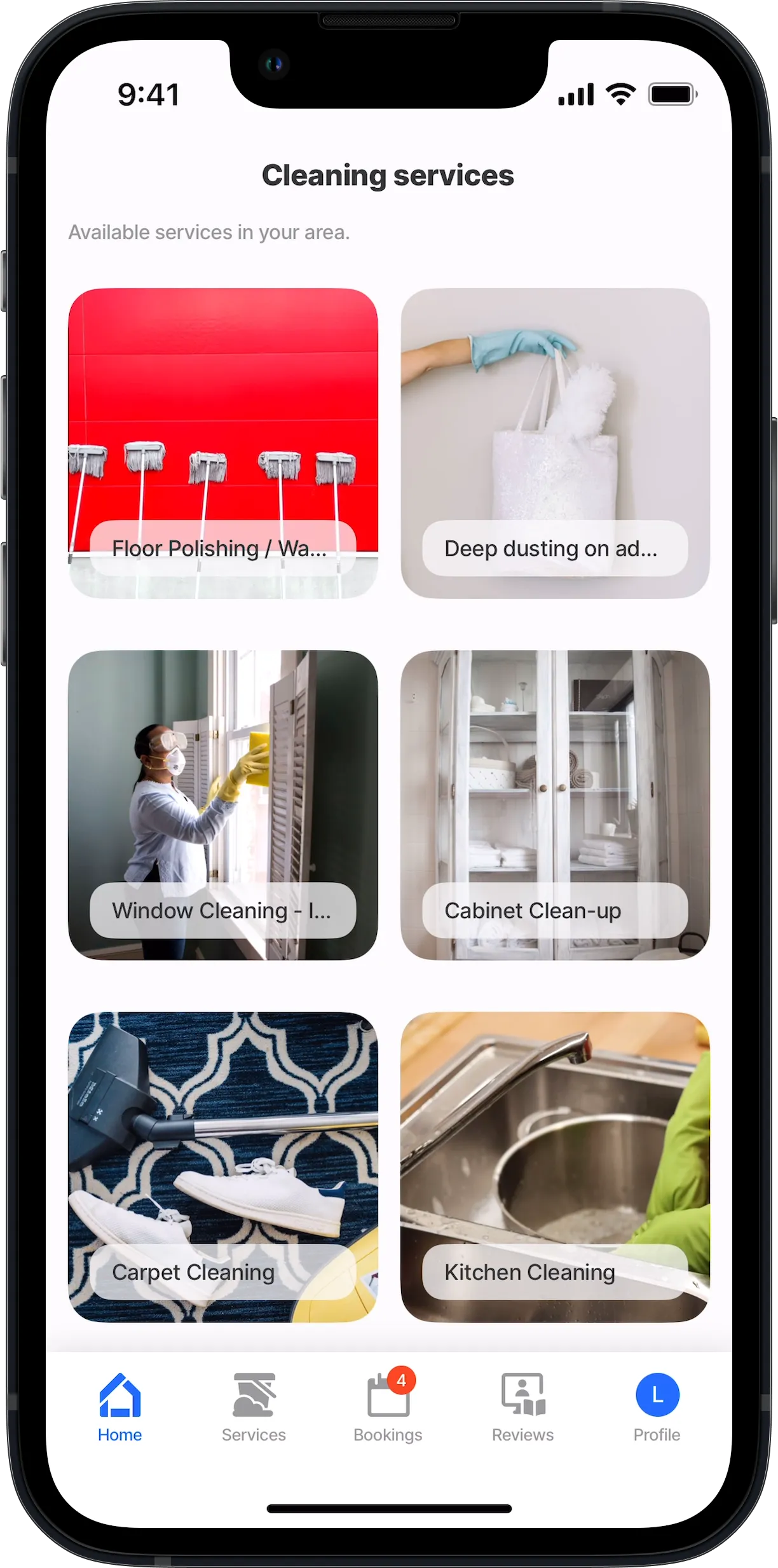
jig.grid
The jig.grid enables you to create grid layouts in your app, organizing content into rows and columns for a visually consistent and flexible interface. It helps align elements proportionally, ensuring a structured design. The grid is ideal for creating galleries to display photos or product images, as well as dashboards, menus, and product lists.


The jig.grid has two available configuration options:
- Auto Grid - used to create a grid layout from a datasource. This is similar in configuration to a jig.list where a single grid-item is configured and iterates through the datasource.
- Custom Grid - used to create a custom grid layout using widgets, images, or custom components in various sizes.
Core structure | |
|---|---|
title | Give the a title that is displayed at the top of the screen. If you do not want to show a title in a use title: ' '. |
type | Select jig.grid for a grid layout configuration. |
component | Within a grid jig type, the grid-item component is used to define each of the elements in the grid layout. Within the grid-item a select set of components can be configured. |
datasources | Configure a datasource to call the data to display in the grid layout. The datasource property is required for the Auto Grid, but is optional for the Custom Grid selection. |
Other options | |
|---|---|
actions | Choose from the provided list of available actions, for example, use the go-to action to open a different . |
badge | Enhance your tabs with a badge, for instance show the number of grid-items. Add the badge property to the YAML with an expression. |
description | Give the a description that is displayed under the title. |
data | Reference a global datasource to use in the . |
grid-item | size - Select either 1x1, 2x2, 2x4, 4x2, 4x4 children - Select a component from the predefined list to display in the grid. The components for selection are: - Custom components (Alpha) - image - widgets - Use Template - image templates |
expressions | Use the expressions property to set expressions that are reusable throughout the . |
header | Configure a jig-header that displays and image, location or video at the top of the . |
icon | The icon will be displayed on the widget of this . Start typing the name of the icon to invoke the available list in IntelliSene. See Jigx icons for information on working with icons. |
inputs | Configure inputs that allow you to receive data from other s and use it in the current . |
isCollapsible | When the is used in a jig.composite and this property is set to true, a collapse and expand icon is shown, allowing the to be collapsed. This is helpful if the composite has a number of s configured, making it easier to view and interact with the app. |
isInitiallyCollapsed | When the property is set to true and the is part of a composite , the will open in collapsed mode when the composite is launched. |
isWaitingSync | Displays a waiting sync indicator. |
jigId | Give the a unique id that can be referenced outside the , for example in state expressions. |
outputs | Configure outputs that allow you to transfer data out of the current and use it in another . |
placeholders | Create a placeholder to show when there is no data to use yet. See tips and tricks -use a placeholder for a placeholder example. |
preview | Configure the Preview which is triggered by long-pressing on the grid-item. |
summary | Add a summary component that displays at the bottom of the . |
Events | |
|---|---|
onFocus | Configure an action that executes when the opens, for example, reset-solution-state. |
onRefresh | Configure an action that executes when the is pulled down, for example, sync-entities. |
- When using the grid-item with a component.jig-widget, note of the following:
- A widgetId is required if the referenced includes a widget configuration. This value should match the Widget Name specified in the referenced .
- If no widget configuration exists, the widget's icon is derived from the 's icon value. If none is specified, a default icon is assigned.
