Components (controls)
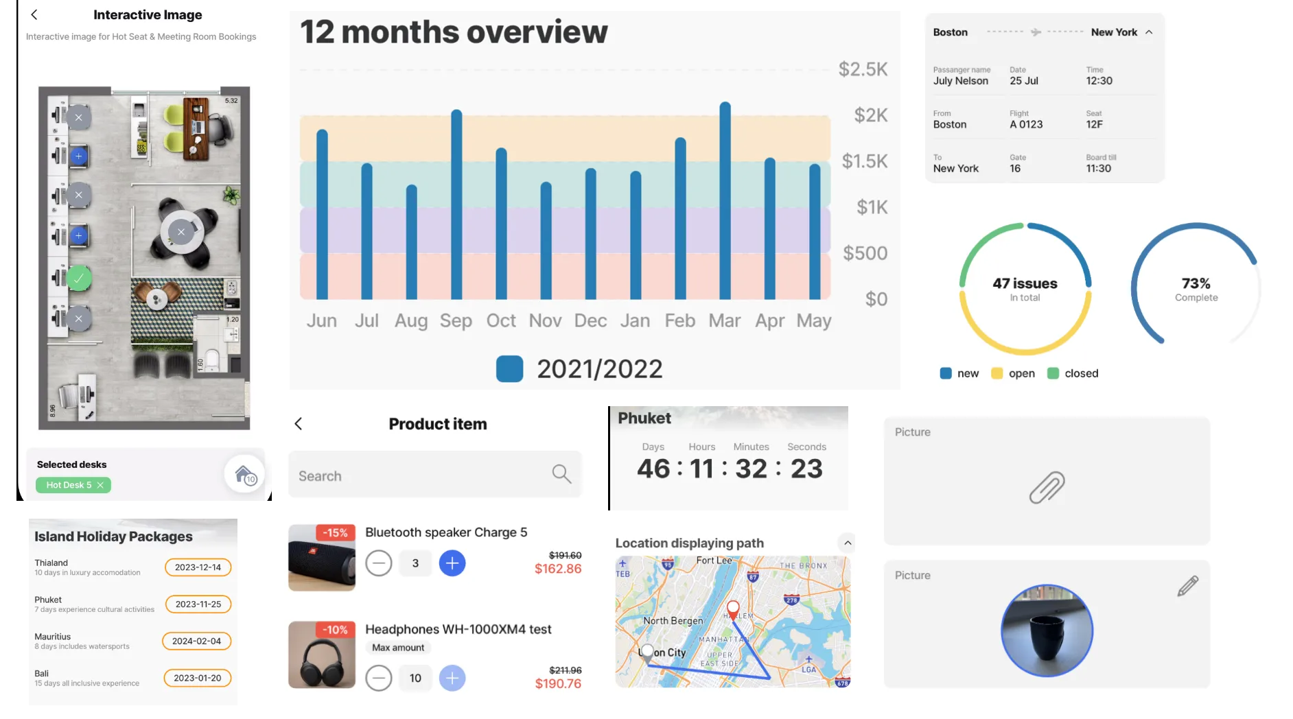
comprises of UI elements known as components, which are an essential part of the app. These components can be in the form of images, avatars, forms, lists, progress bars, charts, and more. They are modular, customizable, and reusable, which ensures consistency and ease of use across the app. These components have predefined behaviors but can be customized to suit your specific requirements. Utilizing these components allows you to create visually appealing and interactive screens that enhance the overall user experience.

- Planning the design of each app screen helps decide which component is best suited to achieve the desired functionality.
- Components can be shown in the Content widget components, for example, a pie chart or image displays in the widget either on the or on a .
- Certain components can only be used in specific jig types, for example, event can only be used with jig.calendar. Use IntelliSense (ctrl+space) in each type to see a list of available components for that or reference the table below.
Type | Component | Jig Type |
|---|---|---|
Content containers | card | default |
| carousel | default |
| expander | default list |
| image | default |
| jig-header | default calendar list document composite |
| list list-item product-item stage | list default |
| location | default full-screen |
| default | |
| stepper | default |
| web-view | default |
| video-player | default |
Display | divider entity field-row entity-field section | default |
Informational | avatar | default |
| bar-chart | default list |
| countdown | default |
| event | calendar |
| line-chart | default |
| pie-chart | default list |
| progress-bar | default |
| summary | default list document |
Input controls | default | |
Interactive | default | |
Navigation | widgets | default composite list document |
In the YAML format for a component is type: component.avatar and is configured at a specific level, and under a property depending on the type.
- In default jigs components are configured under the children: property.
- In full-screen jigs components are configured under the component: property.
- In list and calendar jigs components are configured under the item: property.
Multiple components can be added in certain types such as the default which is the most versitle. The components are configured at the same level as the first component; or are nested under other components but will be preceeded by a children: property.
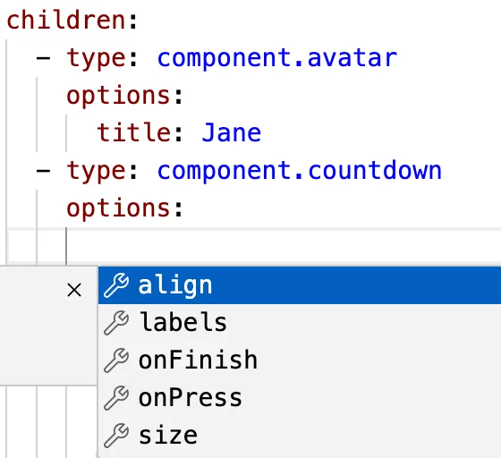
Each components YAML loads with the core required properties. Use IntelliSense under each components options: property to discover additional optional properties. These properties usually help with styling, postioning and size.


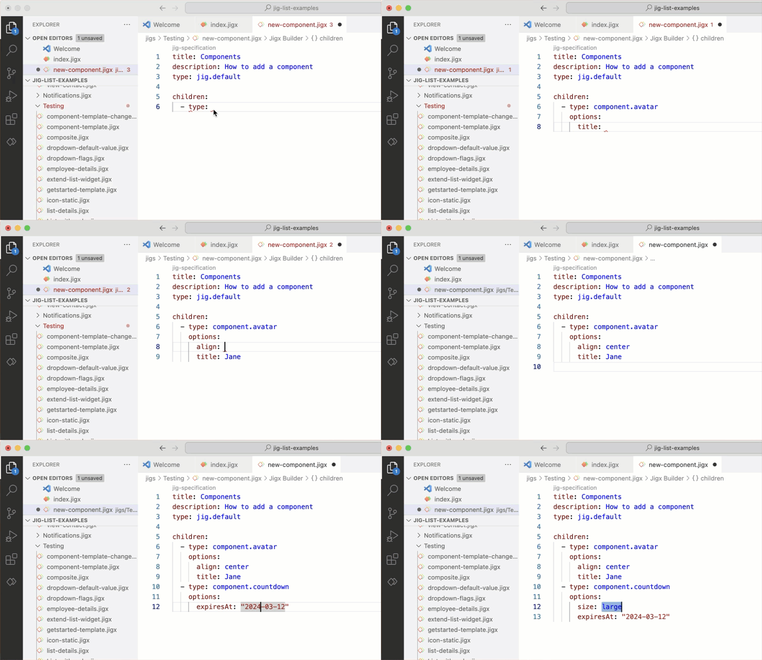
- Open or create a solution in .
- Open the type where the component must be configured. The default YAML structure of the prepopulates.
- Under the correct YAML level (either under children, item, component depending on the type), ctrl+space to invoke Intellisense for the list of available components.
- Select the required component, the core properties will load in the code snippet. Configure the properties accordingly using expressions and values.
- Use IntelliSense under each components options: property to discover additional optional properties, relating to styling, positioning or size.
Creating dynamic, interactive, and user-centric s require components to be functional, and relevant to the user. To achieve this use data when configuring components, and expose the specific data in the compoment by configuring expressions, such as: type: component.countdown options: expiresAt: =@ctx.datasources.event-dd[2].StartDate
Certain components make it easy to add data through a data: property set at the start of the component allowing the data fields to be easily referenced in expressions. For example:
Engaging users on every screen of your app is vital to its success. By adding actions to your components you add an interactive element that keeps the user engaged. For example, in a list component you can press on an item in the list, or swipe left or right to delete/update or go to another . Actions that can be added to components are configured as part of the component YAML and are available by invoking intellisense. Here is a list of actions to use with components:
- onChange
- onDelete
- onSuccess
- onPress
- onFinish
- swipeable
Component/Property | Description |
|---|---|
entity > section | Create relevant display sections for the information to be functional yet elegant and neatly organized. |
enitiy > enitity-field | Entity-fields are used for display purposes only, such as displaying text, numbers, dates, and currency from a datasource. Entity-fields are available in default jigs and can be nested under field-row and/or section components if required. |
entity > field-row | The field-row component contains other components and displays them on the same row. This component ensures that items are placed next to each other instead of underneath each other. By default all components are automatically placed in a new row. |
leftElement | The leftElement property is used to place visual elements on the left-hand side in a component, such as an icon, image, text or button. |
rightElement | The rightElement property is used to place visual elements on the right-hand side in a component, such as an icon, image, text or button. |
leftIcon | The leftIcon property is used to place an icon on the left-hand side of a component. |
rightIcon | The rightIcon property is used to place an icon on the right-hand side of a component. |
See Component Templates for steps on how to add components from a preconfigured set of templates.
In the example tab, you can see code examples for each component.
