Widgets
Widgets are navigational menu blocks shown either on the Home Hub or in a jig (screen) and are used to display information and provide interactivity. Widget sizes and content, such as icons, locations, images, charts, and more, are configurable.
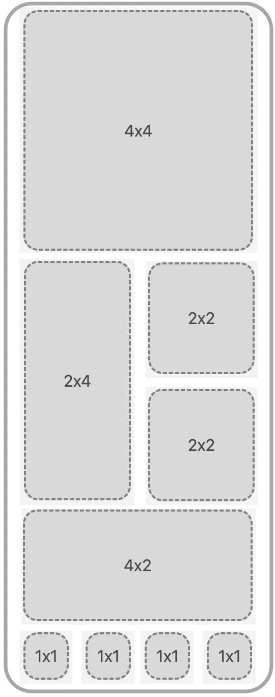
A widget can be configured with the following sizes: - 1x1 - 2x2 - 2x4 - 4x2 - 4x4 Consider the layout of the widgets on the mobile app screen. Specific sizes cover the entire width of the screen, for example, 4x4. The image on the right shows the layout of widgets on a mobile app screen.
- Add an icon to the top level of your .
- Widgets are configured in the YAML in a file and a unique Widget Name is provided that is referred to as the widgetId.
- If inputs are required to pass data into the widget then configure them in the grid-item under the inputs property. Inputs are not mandatory and are dependant on the scenario.
By default when tapping on a widget you are directed to the corresponding . You can change the behavior of the widget by adding an onPress event to the widget configuration. The onPress is configured with an action, which is triggered when pressing on the widget. Use IntelliSense to see the available list of actions.
There are various UI elements available to make your widget inviting and engaging to end users. Content or information can be shown on the surface of a widget. Here is a list of available content/information widgets:
Widget content | Description |
|---|---|
icons | Choose an icon from thousands of available icons. |
Configure a button with an action that executes. | |
avatar | Display an avatar on the widget. |
chart | Configure a bar, line or pie chart to display on the widget. |
image | Configure an image to display on the widget, consider the size: of the widget to ensure the image displays as expected , 1x1 is not suitable for most images. |
list | Display a list of data in the widget with additional left and right elements if required. |
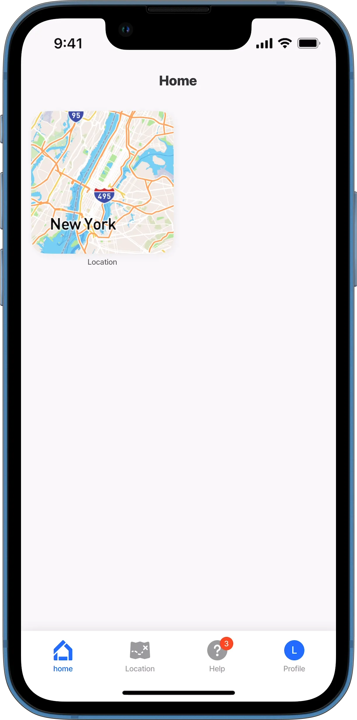
location | Show a location in a map on the widget with markers. |
status | Configure a visual representation of a status, such as goal status, or sales quarterly status. |
value | Show values and amounts on the widget, such as Sales target or number of orders to date. |
- To configure the widget content specify the widget: property at the bottom of the .
- Provide a Widget name for the widget that is referenced as the widgetId.
- Select the type of content to display in the widget.
You still need to add the widget size: and jigId to the grid-item component after changing the content of the widget in the file.
By default widgets are shown on the grid-item with an icon. If no icon is specified assigns a default icon to the widget. To configure an icon, add the icon property in the itself. Start typing the first two letters of an icon to see a list of thousands of icons you can choose from.
In the example below the location icon is specified to replace the default icon.
- In open the whose widget you want to configure.
- Use IntelliSense (ctrl+space) at the root level and select widgets:.
- Specify the Widget Name.
- Next choose the type: of content to display on the widget, such as widget.location use IntelliSense to invoke the list of available types.
- Depending on the type you selected additional properties are required, see widget examples on how to configure each type accordingly.
In the example below the widget content is configured to show a location on the widget surface.
The widgets display order on a screen is determined by the order of the grid-item in the YAML. You can change the order of the widgets by simply changing the order in the YAML. It is important to take into consideration the configured size of each widget when ordering widgets. Changing the order of the widgets can give your app a completely different look. Placing a 4x2 followed by 4x4 will result in white space next to the 4x2.
Reordered and resized widgets.
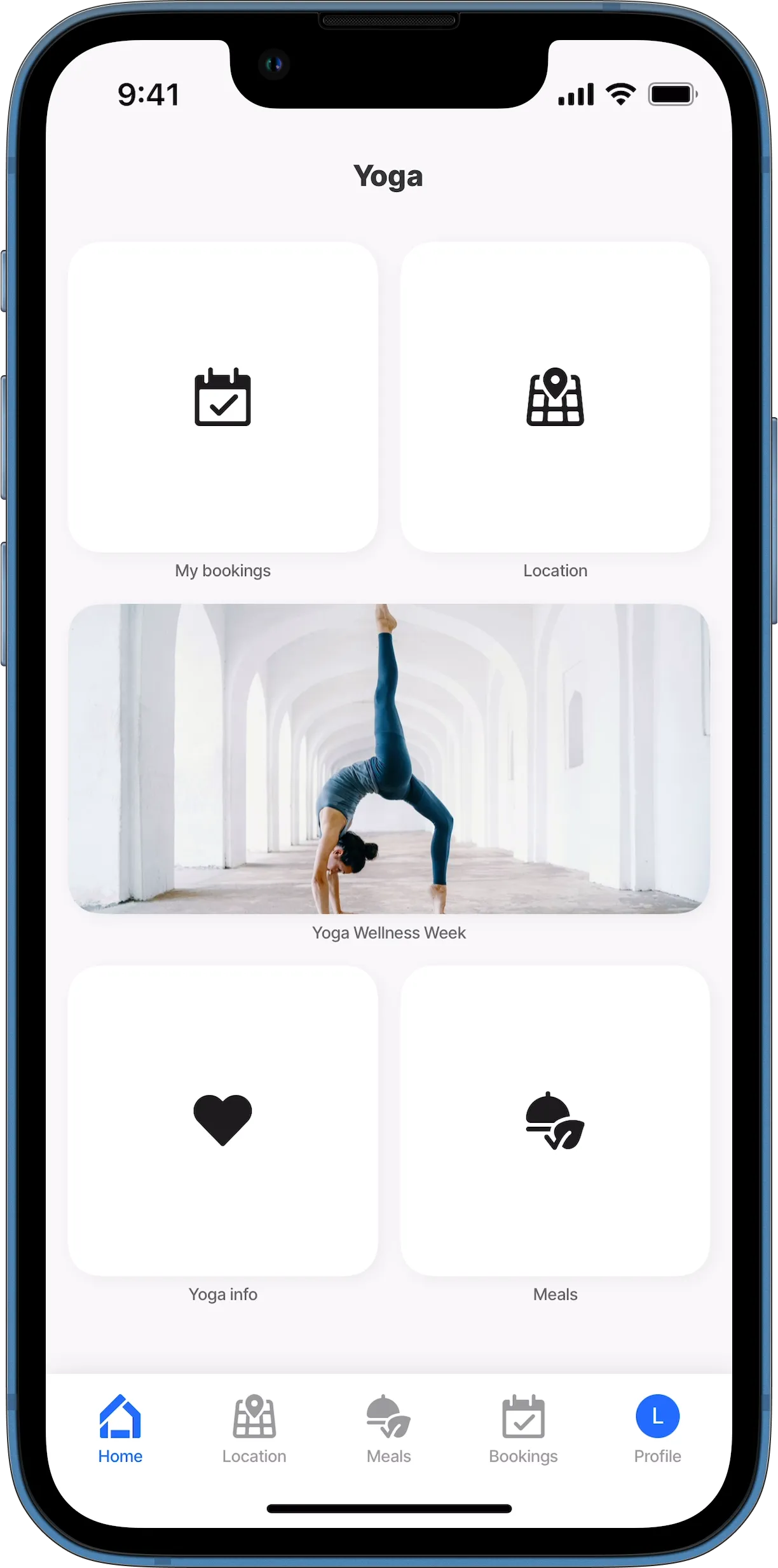
Widget labels are shown under the widget, and are read from the configured title: property of the .
- To display a widget with no label use title: ' ' in the .
Enhance your widget with a customizable badges for instance showing the number of events this week or the number of new orders. Add the badge property to the YAML with an expression.

Inputs allow you to pass data to the associated with the widget. For example, when a customer taps on My Orders widget the input is configured to pass that specific customer's Id and Name to the ensuring only the orders for that customer are shown. For more information on inputs see Passing data using inputs.
You have the ability to control which widgets are visible as well as when the widget must be visible.
- Control which widgets are visible to certain user groups by granting permissions on each widget in a solution in Jigx Management > Widgets. By default everyone with access to the solution has the widgets visible in the app.
- Use the when: property configured by an expression or a boolean statement to determine when a widget must be visible. For example, show the order widget when there are orders awaiting approval.
- The content of the widget will determine the size to select. For example, showing an image or location on a 1x1 widget will not display well rather uses a 4x4 or 4x2.
- Best practice is to arrange widgets that fill the screen with no additional white space. Plan and design the widget layout and size of each widget in a design app or simply draw it on paper. For more information see Planning your app.
- A 1x1 widget will only display an icon.
See Widgets for full code samples.
