Date Picker

Date Picker
| Core structure | |
|---|---|
instanceId | The unique identifier for the date-picker field that can be referenced elsewhere. This is useful when saving the date to a datasource. |
label | Provide a label to guide people on the what they selecting, for example, date of birth or start date. |
| Other options | |
|---|---|
color | Select a color from the to change the color of the field and label based on a when condition. First evaluated to true will be used. |
errorText | Provide text message to display when field's value is not valid. The message is displayed in isNegative style (red). Use an expression to determine when to show the field. |
format | Select the format of the date/time: LT - 3:28 PM LTS - 3:28:57 PM LLLL - Thursday, March 3, 2024 3:28 PM LLL - March 3, 2024 3:28 PM LL - March 3, 2024 (default) L - 03/03/2024 l - 3/3/2024 ll - Mar 3, 2024 lll - Mar 3, 2024 3:28 PM llll - Thu, Mar 3, 2024 3:28 PM HH:mm - 15:28 |
helperText | helperText is displayed only when there is no errorText property configured as errorText takes priorty. |
icon | Add an icon to the field. See for more information on adding icons. |
isRequired | The default setting is true making the field required, useful when used in form submission. Set to false the field is not required and the field is marked (optional). |
isIgnored | Set to true, the field is ignored when submitting the form. |
isHidden | Set to true, hides the field on the form. Use an expression to determine when to hide the field. |
initialValue | Initial value for the field. You can use this to preset the value, so user do not need to change the value and can use this as the default. Using the reset-state action with initialValues does not clear the field, it resets the date back to it's initialValue. |
isOptionalLabelHidden | If the field is optional (by setting isRequired to false) , setting the isOptionalLabelHidden property to true turns off/removes the (optional) text in the label.This property works in combination with isRequired: false. |
isAutoFocused | By default this field is set to false, use true to get focus immediately after it is displayed. |
maximum | Set a maximum time range f date/ time (UTC time). For example, "2022-04-22 14:00" or "2022-04-22" or "20:00" in case of type "time". Maximum on Android only works with date mode because TimePicker does not support this option. |
minimum | Set a minimum time range for date/ time (UTC time). For example. "2022-04-22 05:00" or "2022-04-22" or "08:00" in case of type "time". Minimum on Android only works with date mode because the TimePicker does not support this option. |
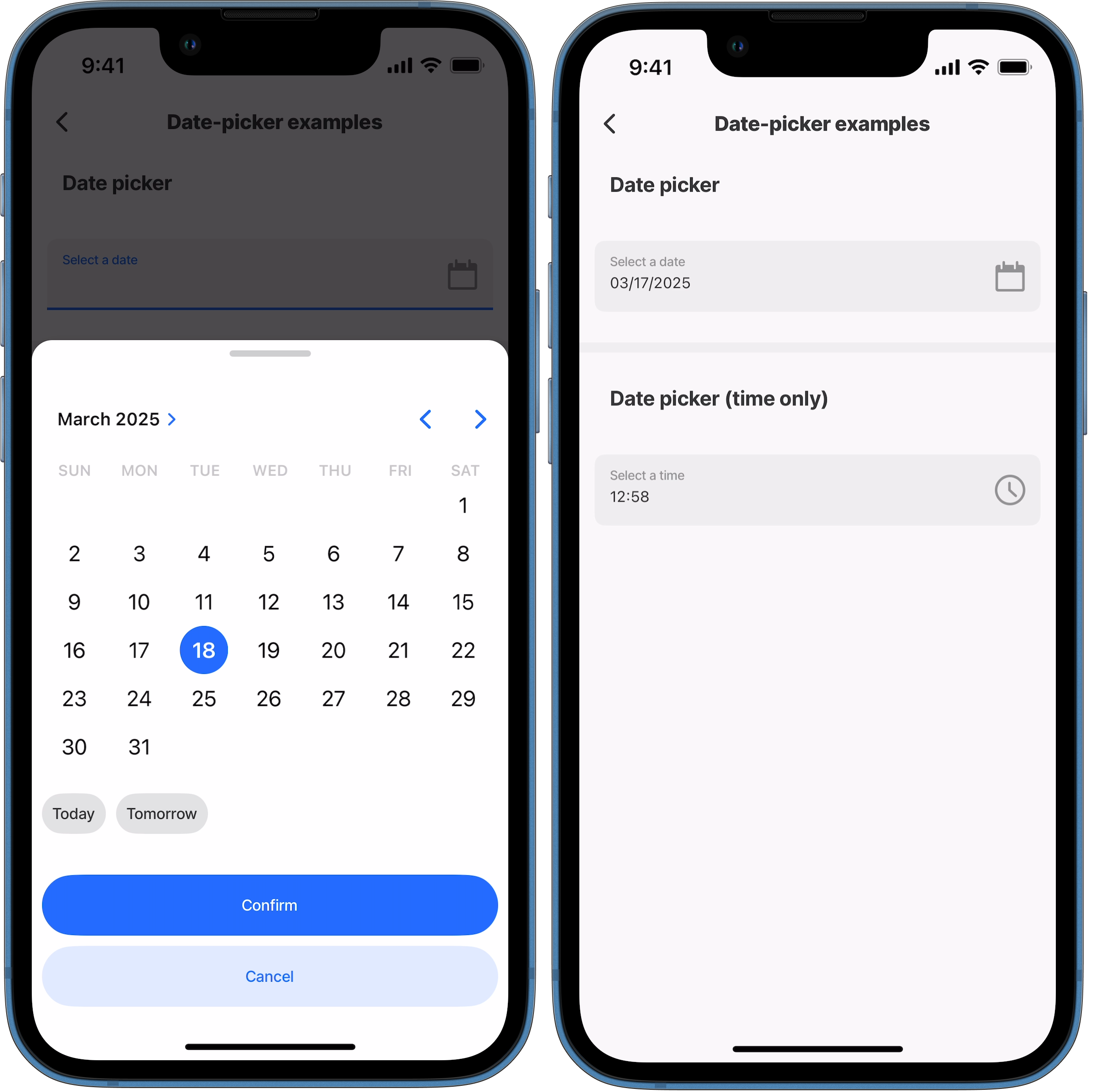
mode | By default the mode is set to date. Use dateTime to show a date and time picker. Use time to only show a time picker. |
nextProperty | Name of the next property to receive focus in the form when using submit on a virtual keyboard. |
style | isPositive - field shows a positive icon (green tick) isBusy - Displays a spinner in the right hand side of the field to show that the field is busy. isDisabled - Set to true disables the date-picker field, preventing the picker screen from popping up. flex - adjust the size of the field. |
value | The value to display in the field. Text field is a controlled component, which means the internal value will be forced to match a UTC time, if it cannot an Invalid date error displays. |
| Action | |
|---|---|
onChange | Select an action to execute when the date-picker component's value is changed. |
| State Configuration | Key | Notes |
|---|---|---|
=@ctx.component.state. | value | State is the variable of the component. |
=@ctx.solution.state. | activeItemId now | Global state variable that can be used throughout the solution. |

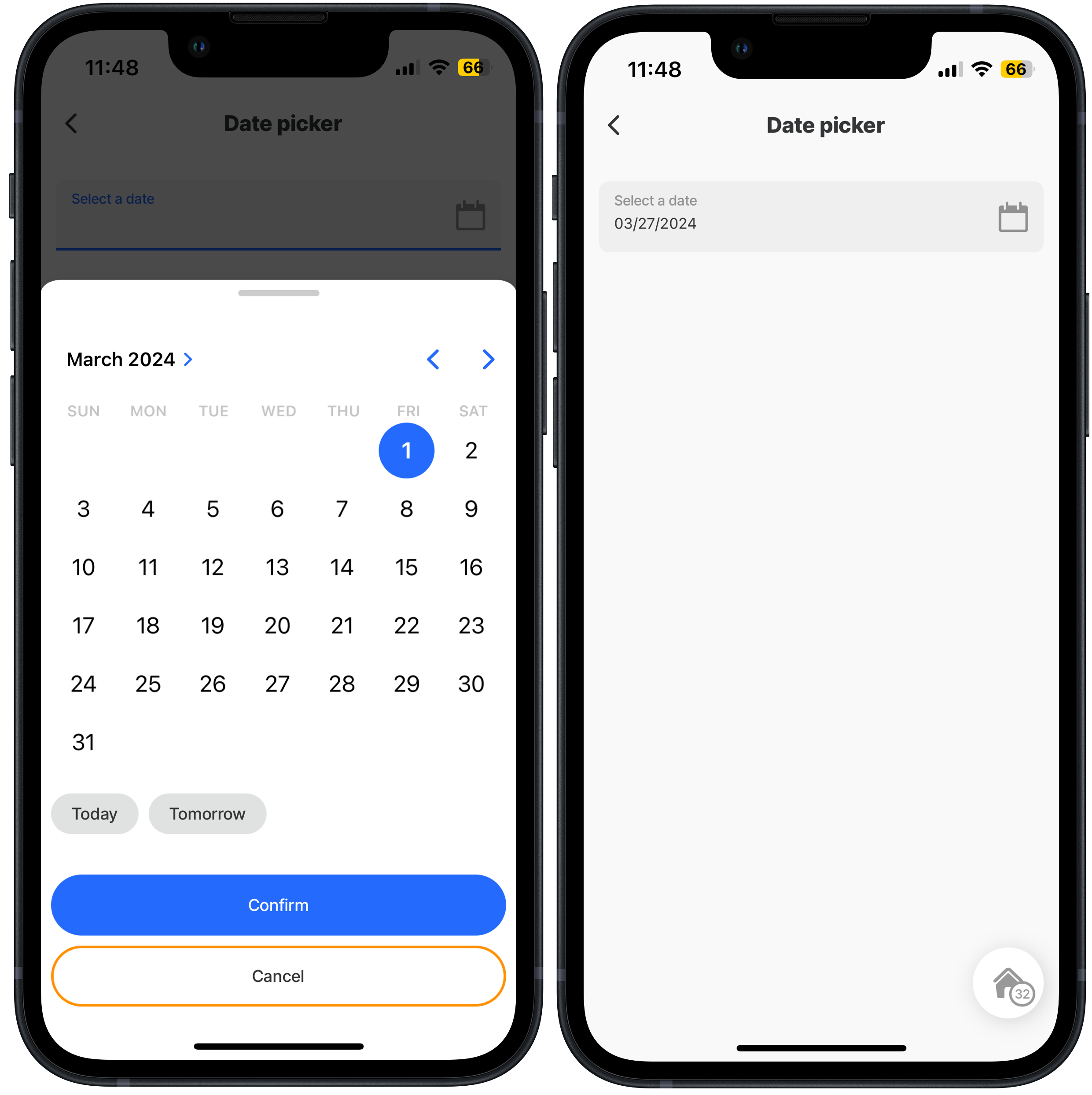
Date picker- input + output

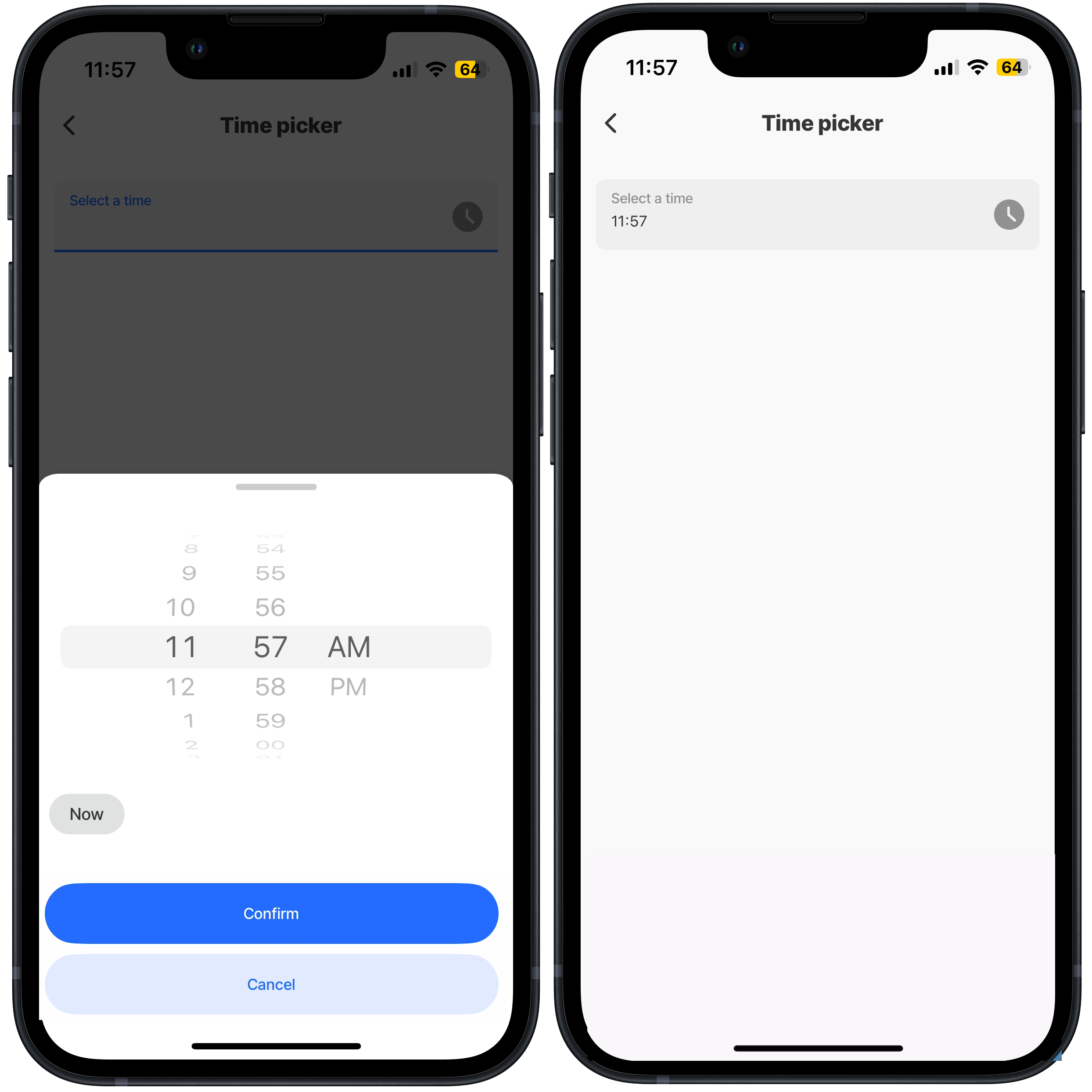
Time selector - input + output
Date range with minimum & maximum