jig-header

The jig-header component can be used in any type of jig. It serves as a container for specifying headers. It cannot be used without a component image, location, or video-player inside the component.

The images can be preloaded and cached using the asset folder's images file. The images will be displayed even when you are offline. For more details, refer to Assets.

Configuration options

Some properties are common to all components, see Common component properties for a list and their configuration options.

Core structure

children

Specifies which component will be used inside the jig-header. There are three options:

height

Specifies the height of the header.

  • small

  • medium

actions

Choose an action from the available list, such as go-to to open a different jig or open-url to navigate to a website. The selected action appears as a link in the top right corner of the header. Set the icon property in the action to display the action link as an icon instead of text. Styles of actions are inherited, for example, disabling the link. You can add multiple action links in the header, but ensure they accommodate the jig title and overall screen design. To prevent the jig title and header action links from overlapping while scrolling, use either one text action or up to three icon actions.

Examples and code snippets

Jig-header with image

Header with image - small
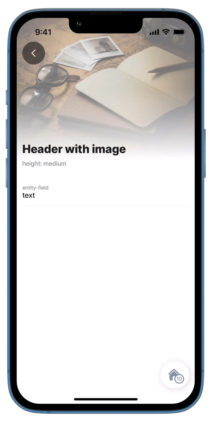
Header with image - medium

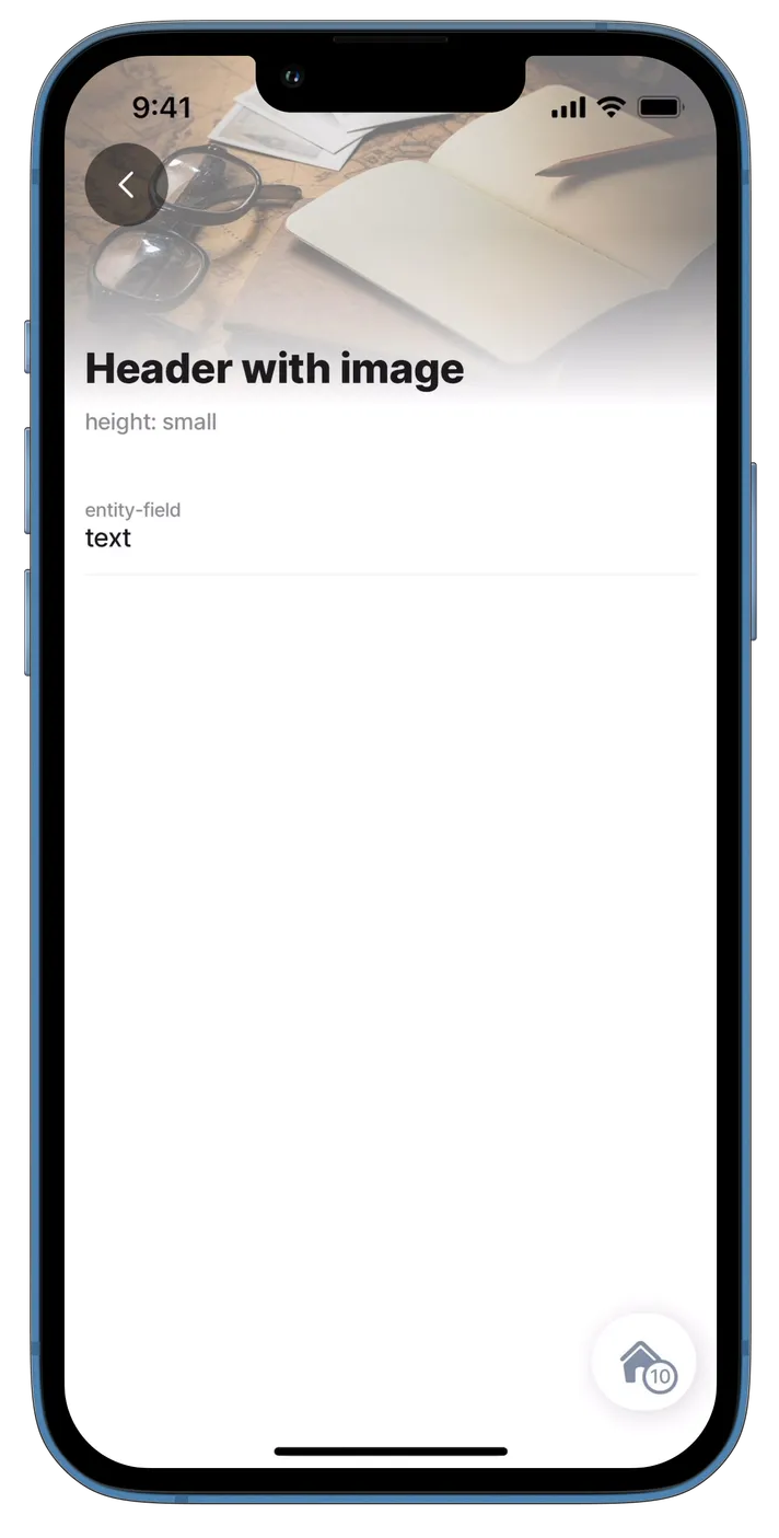
This example shows a component.jig-header with property children: component.image and the difference between the set heights.

Examples: See the code samples using static data in GitHub for small and medium headers.

header:
  type: component.jig-header
  options:
    height: small
    children:
      type: component.image
      options:
        source:
          uri: https://builder.jigx.com/assets/images/header.jpg

Jig-header with location

Location in header
Location in header

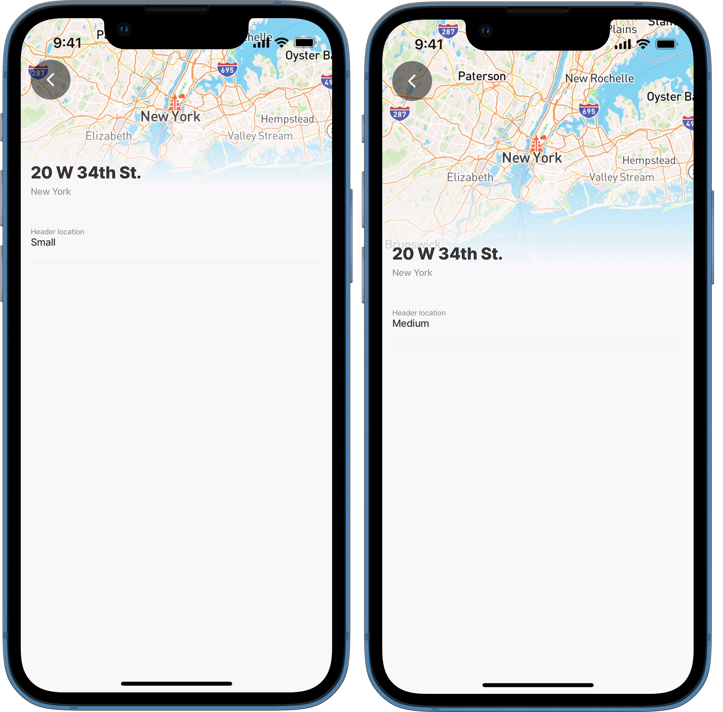
This example shows a component.jig-header with property children: component.location and the difference between the set heights. Refer to the location component for additional location setup options.

Examples: See the code samples using static data in GitHub for small and medium headers.

header: 
  type: component.jig-header
  options:
    height: small
    children:
      type: component.location
      options:
        viewPoint:
          # Center the address in the middle of the screen.
          centerPosition: middle
          # Sepcify the address using a datasource.
          address: [email protected][0].address
          # Zoom in for map clearly.
          zoomLevel: 8
        # Add endpoint marker icon for the address.  
        markers:
          data: [email protected][0].address
          item:
            type: component.marker-item
            options:
              address: [email protected][0].address
              children:
                type: component.icon
                options:
                  # Determine the color of the marker icon.
                  color: negative
                  # Define the icon in the datasource.
                  icon: [email protected][0].icon

Jig-header with video-player

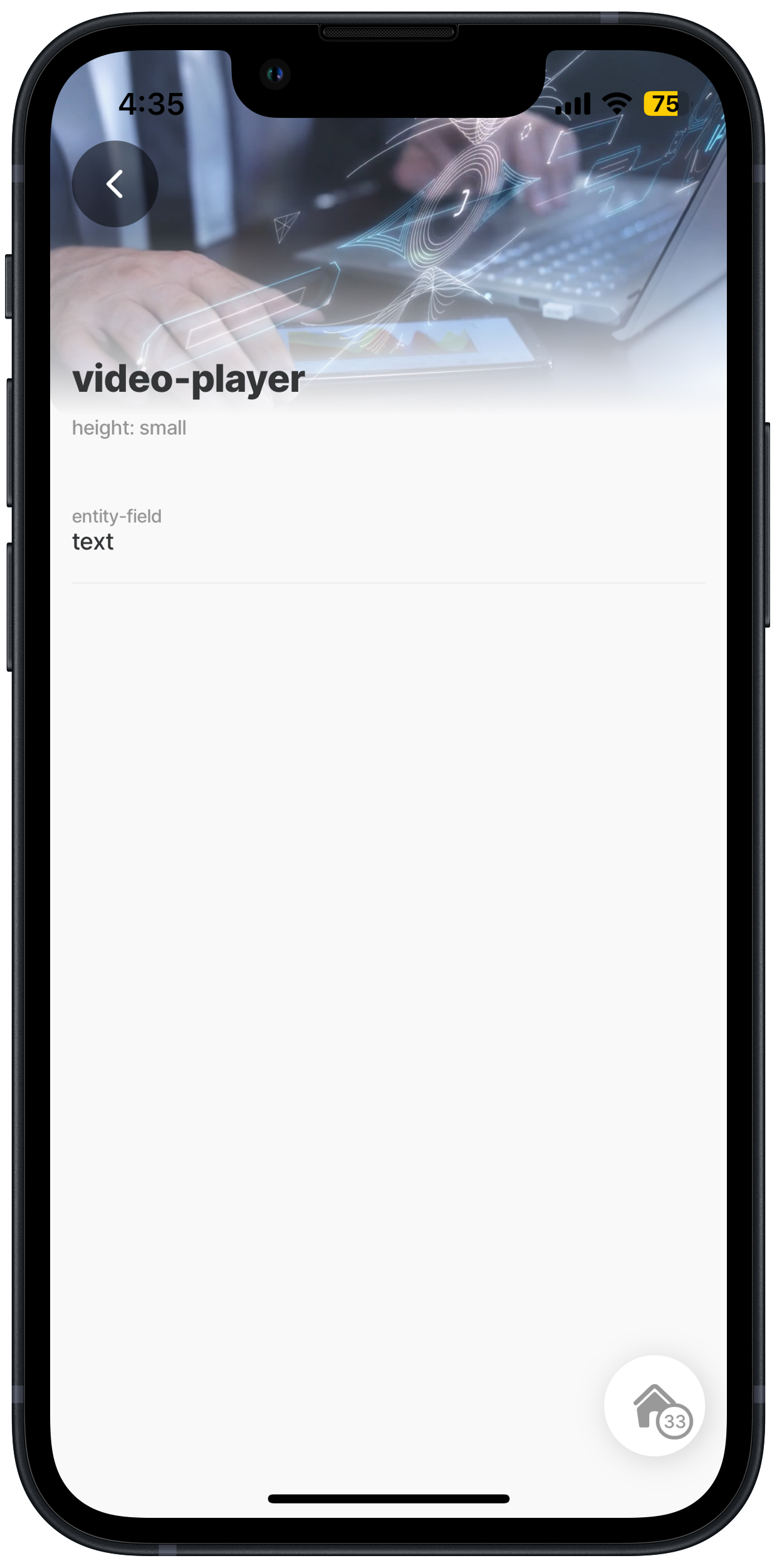
Small - header with video player
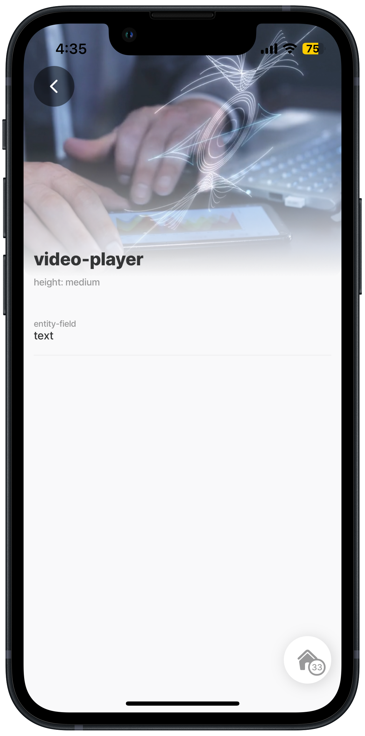
Medium - header with video player

This example shows a component.jig-header with property children: component.video-player. and the difference between the set heights.

Examples: See the code samples using static data in GitHub for small and medium headers.

header: 
  type: component.jig-header
  options:
    height: small
    children:
      type: component.video-player
      options:
        url: https://cdn.pixabay.com/video/2023/10/01/183108-870151713_small.mp4
        title: video-player
        autoplay: false
Jig header with an action

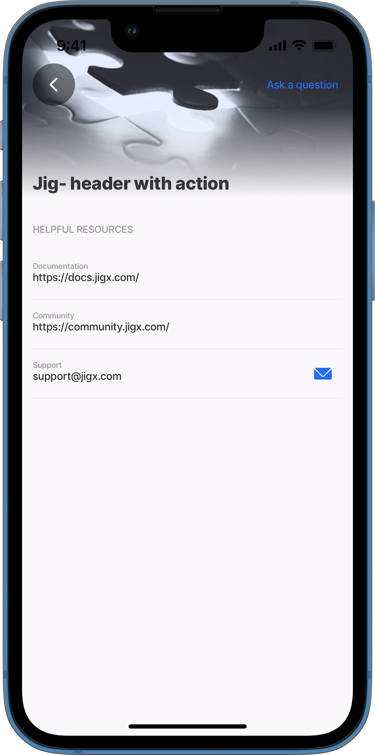
This example shows a component.jig-header configured with an action. The action displays as a link in the top right corner of the header. Ensure the action is visible and not obscured by the header image or video. The open-url action is configured to open the Jigx website.

small
title: Jig- header with action
type: jig.default

header:
  type: component.jig-header
  options:
    height: small
    children:
      type: component.image
      options:
        source:
          uri: https://images.unsplash.com/photo-1605712916066-e143c317df72?w=500&auto=format&fit=crop&q=60&ixlib=rb-4.0.3&ixid=M3wxMjA3fDB8MHxzZWFyY2h8MTR8fHByb2JsZW18ZW58MHx8MHx8fDA%3D
# Configure the action applicable to the header.
# The action displays as a link in the top right corner of the header.            
    actions:
      - type: action.go-to
        options:
          title: Ask a question
          linkTo: ai-chat

children:
  - type: component.entity
    options:
      children:
        - type: component.section
          options:
            title: Helpful Resources
            children:
              - type: component.entity-field
                options:
                  label: Documentation
                  value: https://docs.jigx.com/
              - type: component.entity-field
                options:
                  label: Community
                  value: https://community.jigx.com/
              - type: component.entity-field
                options:
                  contentType: email
                  label: Support
                  value: [email protected]            

Jig-header with multiple actions (icons)

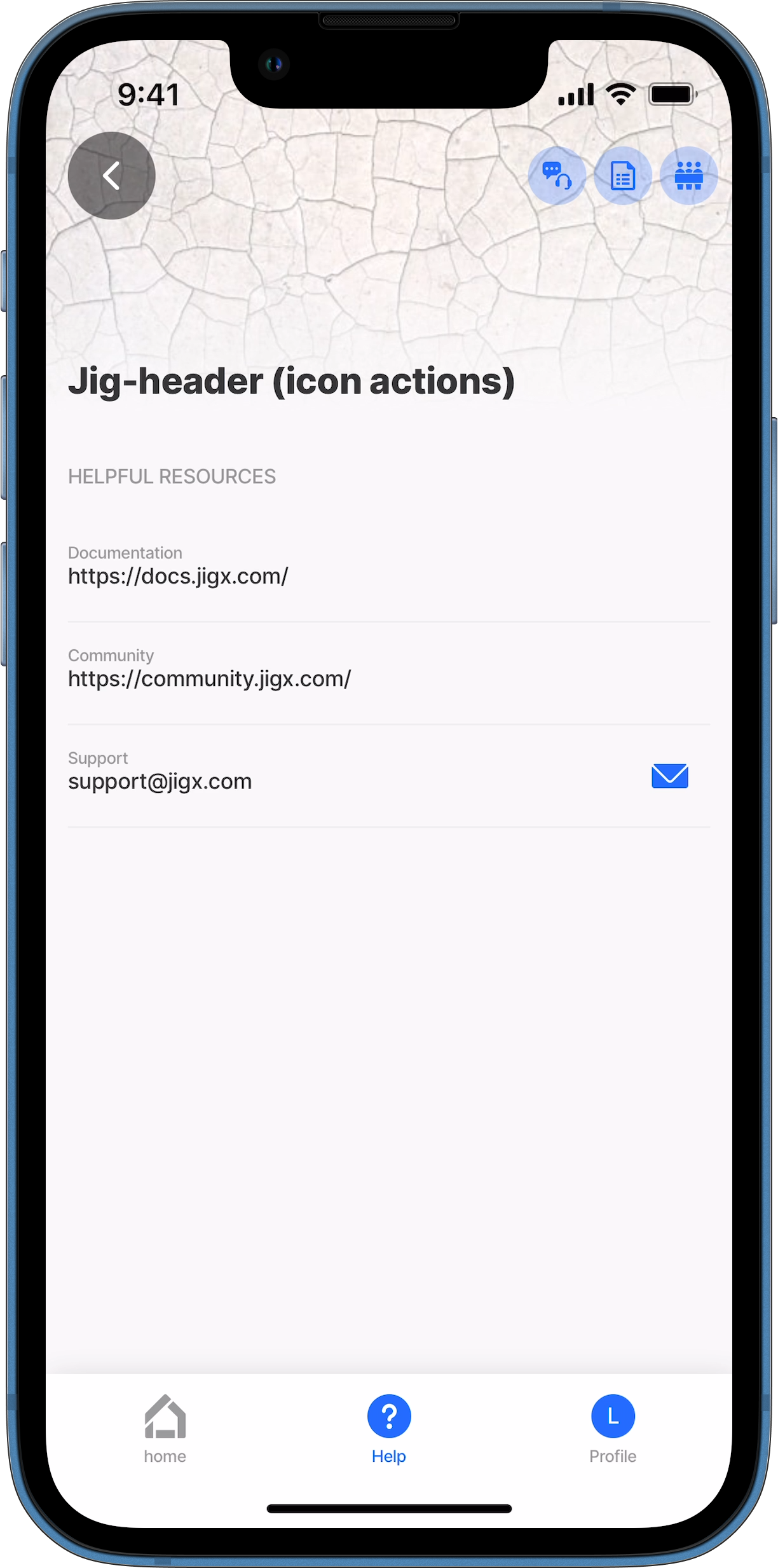
Jig header with icon actions

This example demonstrates a component.jig-header configured with three open-url actions, displayed as icons in the top right corner of the header. Styling is applied to two of the icons to ensure visibility. Make sure the actions are not obscured by the header image/video or the jig title when scrolling. The open-url actions open various Jigx websites.

small
title: Jig- header (icon actions
type: jig.default

header:
  type: component.jig-header
  options:
    height: small
    children:
      type: component.image
      options:
        source:
          uri: 
            https://images.unsplash.com/photo-1475965894430-b05c9d13568a?w=500&auto=format&fit=crop&q=60&ixlib=rb-4.0.3&ixid=M3wxMjA3fDB8MHxzZWFyY2h8MTJ8fHdoaXRlJTIwcGF0dGVybmVkJTIwY29sb3IlMjBiYWNrZ3JvdW5kc3xlbnwwfHwwfHx8MA%3D%3D
# Configure multiple actions applicable to the header.
# Add icons for each action link. 
# Set the style for two of the action icons.
# The actions display the icons (not the text) in the top right corner of the header.          
     actions:
      - type: action.open-url
        options:
          icon: contact-us-customer-support-chat
          style:
          # Displays the icon in red or the brand's designated danger color.
            isDanger: true
          title: Ask a question
          url: https://jigx.com/
      - type: action.open-url
        options:
          # Icon displays in the primary color when no styling is configured.
          icon: document
          title: Documentation
          url: https://docs.jigx.com/
      - type: action.open-url
        options:
          style:
          # Displays the icon in yellow or the brand's designated secodary color.
            isSecondary: true
          icon: people-protester
          title: Community
          url: https://community.jigx.com/       
      
children:
  - type: component.entity
    options:
      children:
        - type: component.section
          options:
            title: Helpful Resources
            children:
              - type: component.entity-field
                options:
                  label: Documentation
                  value: https://docs.jigx.com/
              - type: component.entity-field
                options:
                  label: Community
                  value: https://community.jigx.com/
              - type: component.entity-field
                options:
                  contentType: email
                  label: Support
                  value: [email protected]            

Jig-header actions without header children

In this example, we use the jig-header action to create two actions with icons: one to open an info-modal and another to go-to a different jig.

The jig-header has no children (such as an image, location, or video player), which allows for greater flexibility in the header.

Jig-header action
Jig-header action
title: Header with no children
type: jig.default
# Add the header and only specify actions.
header:
  type: component.jig-header
  options:
    height: medium
    actions:
      # First action to go to a jig. The jig is opened as a modal. 
      - type: action.go-to
        options:
          title: Invoice
          icon: accounting-invoice
          linkTo: monthly-invoice
          isModal: true
      # Second action opens an info-modal showing an avatar.     
      - type: action.info-modal
        options:
          title: ""
          icon: person
          modal:
            title: This is you
            description: [email protected]
            buttonText: Close
            element: 
              type: avatar
              text: Your self
              uri: [email protected]
            
children:
  - type: component.entity
    options:
      children:
        - type: component.field-row
          options:
            children:
              - type: component.entity-field
                options:
                  label: Entity field
                  value: Text

Last updated

Was this helpful?