web-view

This component displays a webpage from a specified URL, content from a datasource, or custom HTML.

You can also use the jig.document type to display web pages in full-screen mode or pass messages from your HTML content via JavaScript to the Jigx App.

Configuration options

Some properties are common to all components, see Common component properties for a list and their configuration options.

Core structure

uri

The source to be displayed in the web-view, for example, a URL.

Other options

content

HTML to render in the web-view.

height

The height of the web-view.

isEditable

A very basic implementation, if set to true, the web-view content becomes editable. This works only with content, not with a uri. The isEditable property is only available when using the web-view in a .

isTrackingTransparencyRequired

If set to true tracking transparency permission modal is shown before opening the URL. The default setting is true.

Consideration

  • The component.web-view can be used in jig.fullscreen, if the content needs to fill the screen.

Examples and code snippets

Web-view example (URL)

Web-view with URL
Web-view with URL

In this example, we open a target URL in the web-view component.

If the target URL is tracking data (e.g., cookies etc.), you are required by Apple to ask for user consent using the isTrackingTransparencyRequired option. It will ask for user consent the first time any web view in your solution tries to open a target URL.

Examples: See the full example using static data on GitHub. See the full example using dynamic data in GitHub.

Datasource: See the full datasource for static data on GitHub. See the full datasource for dynamic data in GitHub.

type: jig.default
title: Web view

children:
  - type: component.web-view
    options:
      uri: [email protected]
      isTrackingTransparencyRequired: true

Web-view example (HTML Content)

Web-view with HTML content

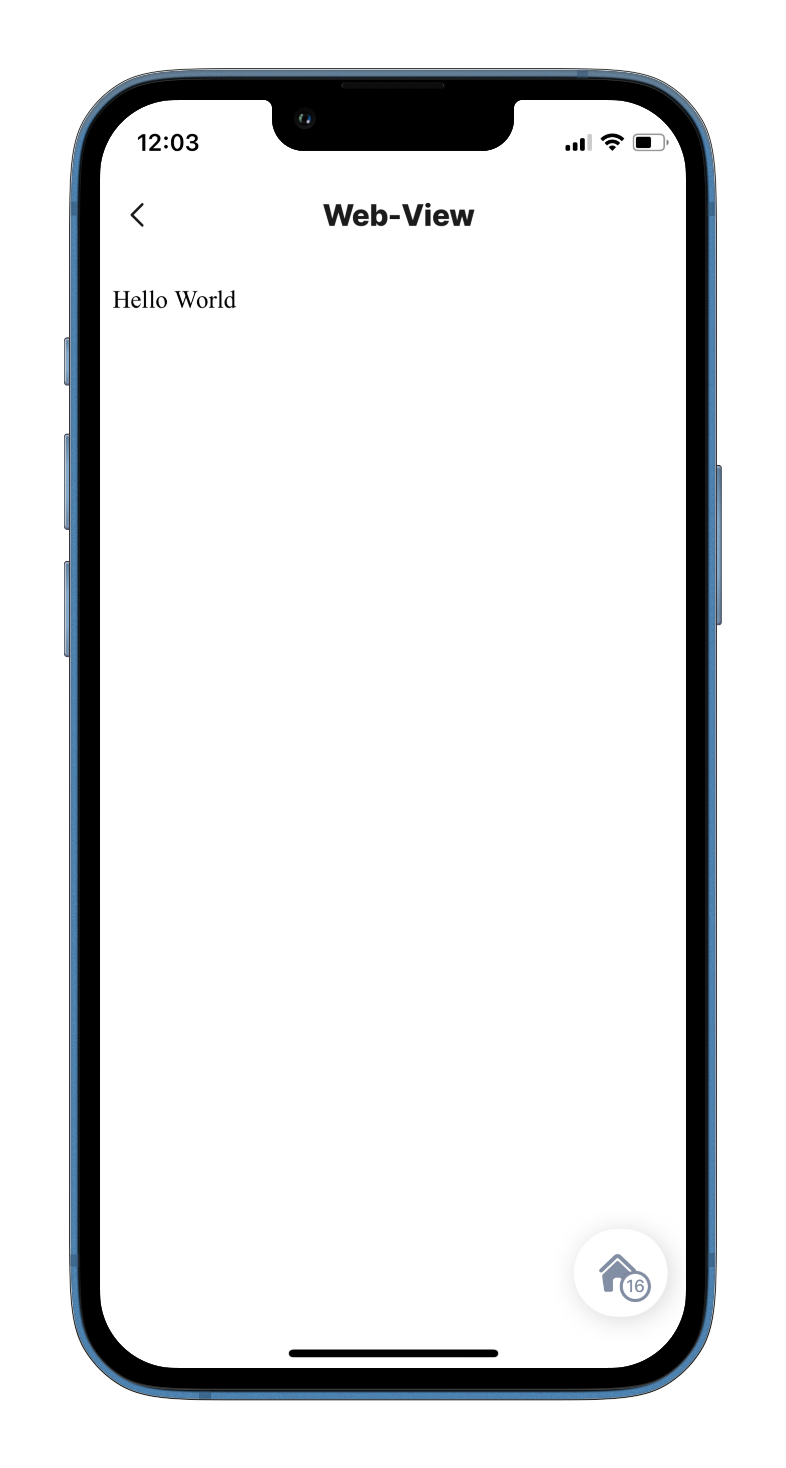
In this example, we are passing raw HTML content to the web-view component. This can either be inline content (see example below) or content from a datasource. If your HTML content does not render as expected (e.g. font too small etc.) embed the meta HTML tag used in the example below in your HTML content.

web-view-raw
title: Web-View
type: jig.default

children:
  - type: component.web-view
    options:
      content: |
        <html>
          <head>
            <meta name="viewport" content="width=device-width, initial-scale=1">
          </head>
          <body>
            Hello World
          </body>
        </html>

Editable web-view content (Fullscreen)

In this example, the web-view component is used to make notes on a job. It is configured in a jig.full-screen to display content from a datasource. The isEditable property is set to true, allowing the text in the web-view to be edited. An execute-entity action ensures the updated HTML is saved to the database.

Editable web-view
Editable web-view
title: Notes
type: jig.full-screen
icon: notes-add

# Add the web-view component using the content property. 
# Set the isEditable property to true,
# to allow the HTML in the view to be edited by tapping the component.     
component: 
  type: component.web-view
  instanceId: edit-notes
  options:
    isEditable: true
    # Add HTML to the content, the HTML will be editable when tapped.
    content: |
      <!DOCTYPE html>
      <html lang="en">
      <head>
        <meta charset="UTF-8">
        <meta name="viewport" content="width=device-width, initial-scale=1.0">
        <title>Notes</title>
        <p><i>Add your notes here</i></p> 
# Configure an action to save the edited HTML to the database.       
actions:
    - children:
        - type: action.execute-entity
          options:
            title: Save notes
            provider: DATA_PROVIDER_DYNAMIC
            entity: default/jobs
            method: update
            goBack: stay
            data:
              id: [email protected]
              job-notes: [email protected]
            # Confirm that the notes were saved successfully.  
            onSuccess:  
              type: action.info-modal
              options:
                modal:
                  element: 
                    type: icon
                    icon: check-2-alternate
                    color: positive
                  title: Notes added successfully
                  buttonText: Exit

Last updated

Was this helpful?