stage

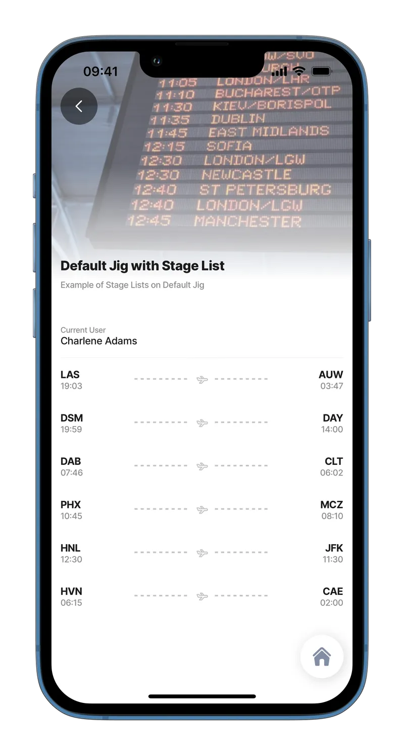
A stage is a primary container for displaying various UI components on the left and right, typically showing a start-and-end concept.

List with stage
List with stage

Configuration options

Some properties are common to all components, see Common component properties for a list and their configuration options.

Core structure

left

Add content to the left element as text, or use an expression.

right

Add content to the right element as text, or use an expression.

title

Add titles for the text on the left and right elements.

Other options

icon

Add an icon to show in the centerElement. A list of icons is available. See for more information.

style

isWaitingSync - Will display a "Waiting sync" indicator (cloud with a line through it), a visual indicator showing that data has not been synced to the cloud yet.

subtitle

Add a subtitle to either the left or right element as text, or use an expression.

Actions

onPress

The action is triggered while pressing on an item in the stage. Use IntelliSense (ctrl+space) to see the list of available actions.

Consideration

  • component.stage can only be used in the component.list or an expander.

Examples and code snippets

List with stage

Stage for flights
Stage for flights

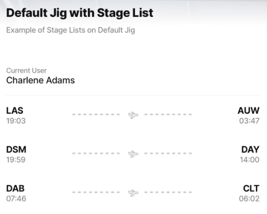
This example shows list items with left and right elements and typically shows a start-and-end concept. Flight schedules are used in this example. However, you can choose a different icon for many different use cases.

Examples: See the full example using static data in GitHub. See the full example using dynamic data in GitHub.

Datasource: See the full datasource for static data in GitHub. See the full datasource for dynamic data in GitHub.

children:
  - type: component.entity
    options:
      children:
        - type: component.entity-field
          options:
            label: Current User
            value: [email protected]
  - type: component.list
    options:
      data: [email protected]
      item:
        type: component.stage
        options:
          icon: plane-1
          right:
            title: [email protected]
            subtitle: [email protected]
          left:
            title: [email protected]
            subtitle: [email protected]

List with expander and stage as a Header

Stage in list with expanders

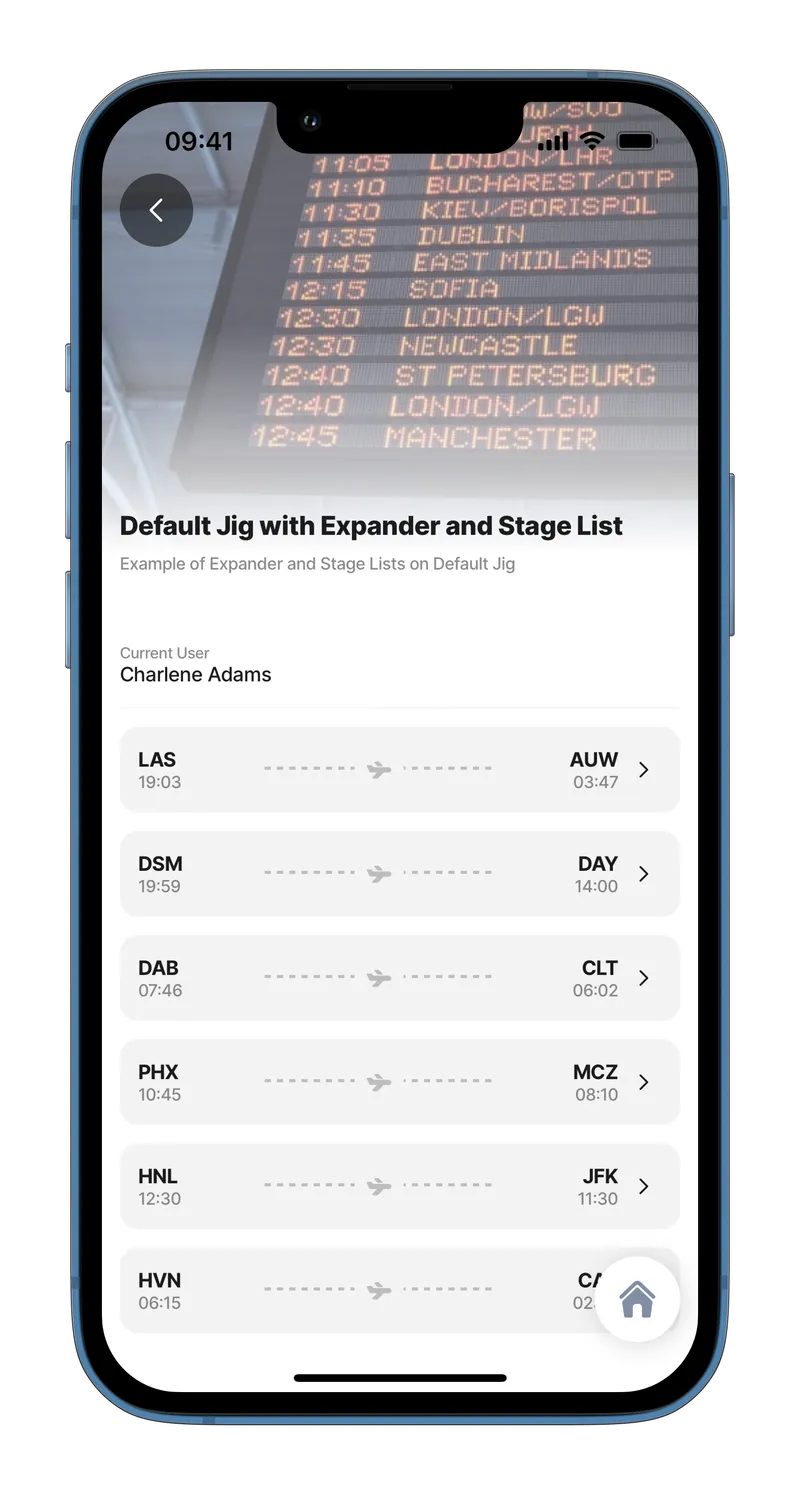
This example shows a list of expanders that have used the stage components as their header elements.

Expanders are ideal for displaying additional information without having to navigate to another page.

Examples: See the full example using static data in GitHub. See the full example using dynamic data in GitHub.

Datasource: See the full datasource for static data in GitHub. See the full datasource for dynamic data in GitHub.

children:
  - type: component.entity
    options:
      children:
        - type: component.entity-field
          options:
            label: Current User
            value: [email protected]
  - type: component.list
    options:
      data: [email protected]
      item:
        type: component.expander
        options:
          header:
            centerElement:
              type: component.stage
              options:
                right:
                  title: [email protected]
                  subtitle: [email protected]
                left:
                  title: [email protected]
                  subtitle: [email protected]
          children:
            - type: component.entity
              options:
                children:
                  - type: component.field-row
                    options:
                      children:
                        - type: component.entity-field
                          options:
                            label: Boarding
                            value: [email protected]
                        - type: component.entity-field
                          options:
                            label: Destination
                            value: [email protected]
                  - type: component.field-row
                    options:
                      children:
                        - type: component.entity-field
                          options:
                            label: Board Time
                            value: [email protected]
                        - type: component.entity-field
                          options:
                            label: Disembark Time
                            value: [email protected]
                  - type: component.entity-field
                    options:
                      label: Passenger
                      value: [email protected]
                  - type: component.field-row
                    options:
                      children:
                        - type: component.entity-field
                          options:
                            label: Flight
                            value: [email protected]
                        - type: component.entity-field
                          options:
                            label: Gate
                            value: [email protected]
                        - type: component.entity-field
                          options:
                            label: Seat
                            value: [email protected]
            - type: component.location
              options:
                viewPoint: 
                  centerPosition: middle
                  address: [email protected]

Last updated

Was this helpful?