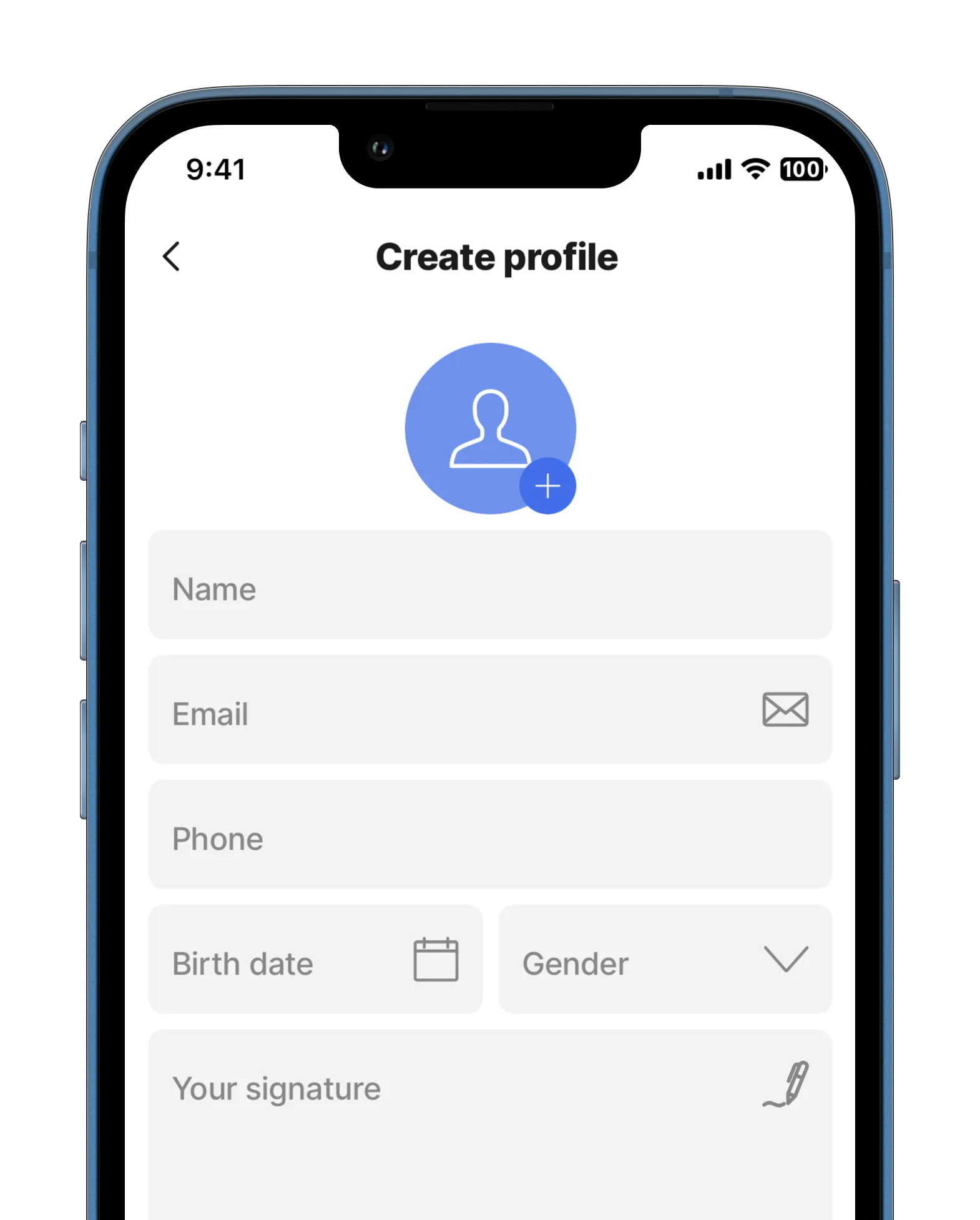
form
Using forms in mobile apps enables users to effortlessly input and submit information, enhancing interaction and user engagement.
This component contains the following components:
These extra components allow for the easy input and collection of data. Using forms, records in a database can be created, updated, or deleted based on user input information.

Core structure | |
|---|---|
children | Define the content of the form. The following components can be used in the form: - avatar-field - choice-field - checkbox - date-picker - dropdown - email-field - field-row - media-field - number-field - section - signature-field - text-field |
instanceId | The unique identifier for the form. |
Other options | |
|---|---|
isDiscardChangesAlertEnabled | When set to true the modal window preventing accidental deletion of your data without saving will pop up. |
initialValues | Specify the data to be used as initialValues for fields in the form. Using the reset-state action with initialValues does not clear the form, it resets the form back to it's initialValue. Tip: For initialValues on a form to function isDocument: true in the datasource, this way you don't have to set it up in the individual components. It is set up in one place and the form will match the components to the column names of the datasource. See the example below for Form with initialValue. |
State Configuration | Key | Notes |
|---|---|---|
=@ctx.component.state. | data isValid isDirty response |
|
=@ctx.solution.state. | activeItemId now |
|


