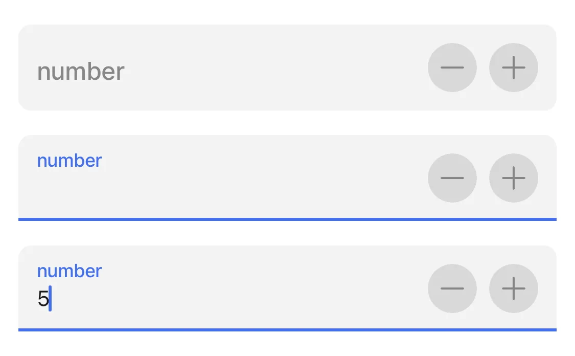
number-field
Number fields in forms simplify the process of entering numerical information. They feature built-in validation to ensure only valid numbers are input. This optimizes user experience by automatically presenting a numeric keypad, facilitating quicker and more accurate data entry.
The component can only be used in a jig.default inside of a form component for an input of a numeric value.

Core structure | |
|---|---|
instanceId | The unique identifier for the number-field. |
label | Provide a label/name for the number-field. 'Label' is displayed as a placeholder when no value is specified. |
Other options | |
|---|---|
color | Sets the color of the number-field property based on conditions by using the when property. First evaluated to true will be used. Choose a color from the provided color palette. Default color is grey if the property is not specified in the YAML. See the list of available colors in Jigx color palette. |
errorText | Add text, string, or expressions to show text under the number-field indicating an error/invalid value in the field. Text is shown in isNegative (red) styling with a red exclamation icon on the right. |
format | Text Format of the value entered. Format is enabled only if field is configured to disabled. style: isDisabled: true |
helperText | Add text, string, or expressions to guide users by showing text under the number-field. Helper text is displayed only when there is no errorText. |
icon | Add an icon to the number-field, for example a dollar icon. The icon apprears on the far right of the field. A list of icons is available. See Jigx icons for more information. |
initialValue | The initialValue is the value that will be displayed in the number-field when the form is initially loaded. You can use this property to preset the field with a default number so that you do not have to manually select it. Using the reset-state action with initialValues does not clear the field, it resets the field back to it's initialValue. |
isAutoFocused | If true the number-field will get focus immediately after the form is displayed and the number keyboard will be opened automatically. |
isHidden | If true the number-field will be hidden on the form. If set to false the field will be shown. |
isIgnored | When true, the field will be ignored when submitting the form and the content will not be stored. |
isOptionalLabelHidden | If the field is optional you can turn off the "(optional)" label by setting this field to true. This property works in combination with isRequired: false. |
isRequired | Set to true when the field is required. Useful when you use it in form submission as the submit button remains disabled until the number-field has a numeric input. Set to false the number-field is optional and will have (optional) in the label. |
isReturnKeyEnabledAutomatically | When set to true, the keyboard disables the return/done key when there is no number and automatically enables it when there is a number. The default value is false. |
isSensitive | If set to true, the number input obscures the number entered so that sensitive numbers stay secure. For example, bank card account details or salary details. |
isTextClearedOnFocus | When set to true, the number-field is automatically cleared when editing begins. |
KeyboardType | Determines which keyboard to open. Default is number-pad. You can select one of the following: - decimal-pad - number-pad - numeric |
minimum | Set the minimum number limit. Used with the maximum property allows you to set an available number range. |
maximum | Set the maximum number limit. Used with the minimum property allows you to set an available number range. |
nextProperty | Name of the property you want to focus next in the form when you use return/next on a keyboard. |
stepper | When the stepper isEnabled property is set to true a - and + icon is added to the right of the number field allowing you to add or subtract numbers. Use the value property to determine the numerical increments when the icon is pressed. For example, value: 5 will increase the number-field by 5 each time the + icon is pressed. The stepper property is greate for an invoicing or order form. |
style | The following property settings are available: - flex - Flex property if rendered inside row. - isBusy - Displays spinner on right side of field. It removes any configured icon. - isDisabled - disables the number-field preventing any input text. - isPositive - a green icon diplays on the right of the number-field. More than one can be true. It will be evaluated based on priority. |
value | The value to show in the number-field when the form initially loads. This can be combined with the isDisable style to preset the value that cannot be edited on the form. |
Actions | |
|---|---|
onChange | The action is triggered when the content in the number-field is changed. Use IntelliSense (ctrl+space) to see the list of available actions. |
State Configuration | Key | Notes |
|---|---|---|
value |
| |
activeItemId now |
|

